


Run the numbers on your own account for a second.
Say you're spending $10,000 a month on Google Ads at a $4 cost per click. That's 2,500 clicks. At a 2% conversion rate you get 50 leads, and each one costs you $200. At a 4% conversion rate you get 100 leads at $100 each.
Same spend. Same ads. Same targeting. Same keywords. The only thing that moved was what happened after the click.
Now the uncomfortable question: how many hours did your team spend on bids, match types, and negative keywords last quarter, and how many did you spend on the page those clicks land on?
Every other lever in a paid account has a ceiling. You can only cut so much wasted spend. You can only tighten targeting so far. Quality Score tops out. Conversion rate is the one lever that multiplies against every click you will ever buy, and it doesn't require Google's cooperation to move.
.png)
What "good" actually looks like
Before you can tell whether your page is a problem, you need something to compare it to.
Across industries, the median landing page conversion rate sits around 6.6%. The top quartile of pages convert at 10% or better. The top decile clears 11.45%.
By vertical, the spread is wide. SaaS pages average around 3.8%. Ecommerce lands somewhere between 3.1% and 4.3% depending on which dataset you use. Healthcare runs 3.0% to 4.2%. Legal services average about 7.4%. Home services lead generation does better at roughly 8.5%. Event registration pages top the list around 12.3%.
Here's the caveat most benchmark articles leave out, and it matters enough that you shouldn't skip it. Those numbers aggregate every traffic source together. Email traffic, direct traffic, and organic traffic all convert differently from cold paid clicks. Someone who clicked a link in your newsletter already knows who you are. Someone who clicked a search ad for a generic category term does not.
So treat these as orientation, not as a target. If you're a SaaS company converting paid traffic at 2.5% and the benchmark says 3.8%, that gap is real but it isn't precise. The comparison that actually matters is your page against your own page last quarter.
.png)
Fix 1: message match
The most common problem we see, and the least expensive to fix.
Your ad promises something specific. The click lands on a generic homepage or a broad service overview. Now the visitor has to re-orient themselves and go hunting for the thing the ad mentioned. A meaningful share of them simply leave instead.
Try this test. Read your ad headline out loud, then load the landing page. Does the page echo that language above the fold? If a stranger landed on the page cold, could they guess which ad sent them there? If not, the match is broken.
A concrete version: an ad targeting "emergency HVAC repair" that lands on a general "HVAC Services" page listing installation, maintenance, seasonal tune-ups, and repair. It's 9pm and this person's furnace just died. They now have to scan a page about tune-ups to find out whether you'll come out tonight. Some will. Many won't.
You don't need forty pages to solve this. Group your ad groups into three to five intent clusters and build one page per cluster. Emergency versus scheduled. New installation versus repair. Residential versus commercial. That's usually enough to close most of the gap.
Fix 2: the form is probably the problem
This is where the data gets hard to argue with.
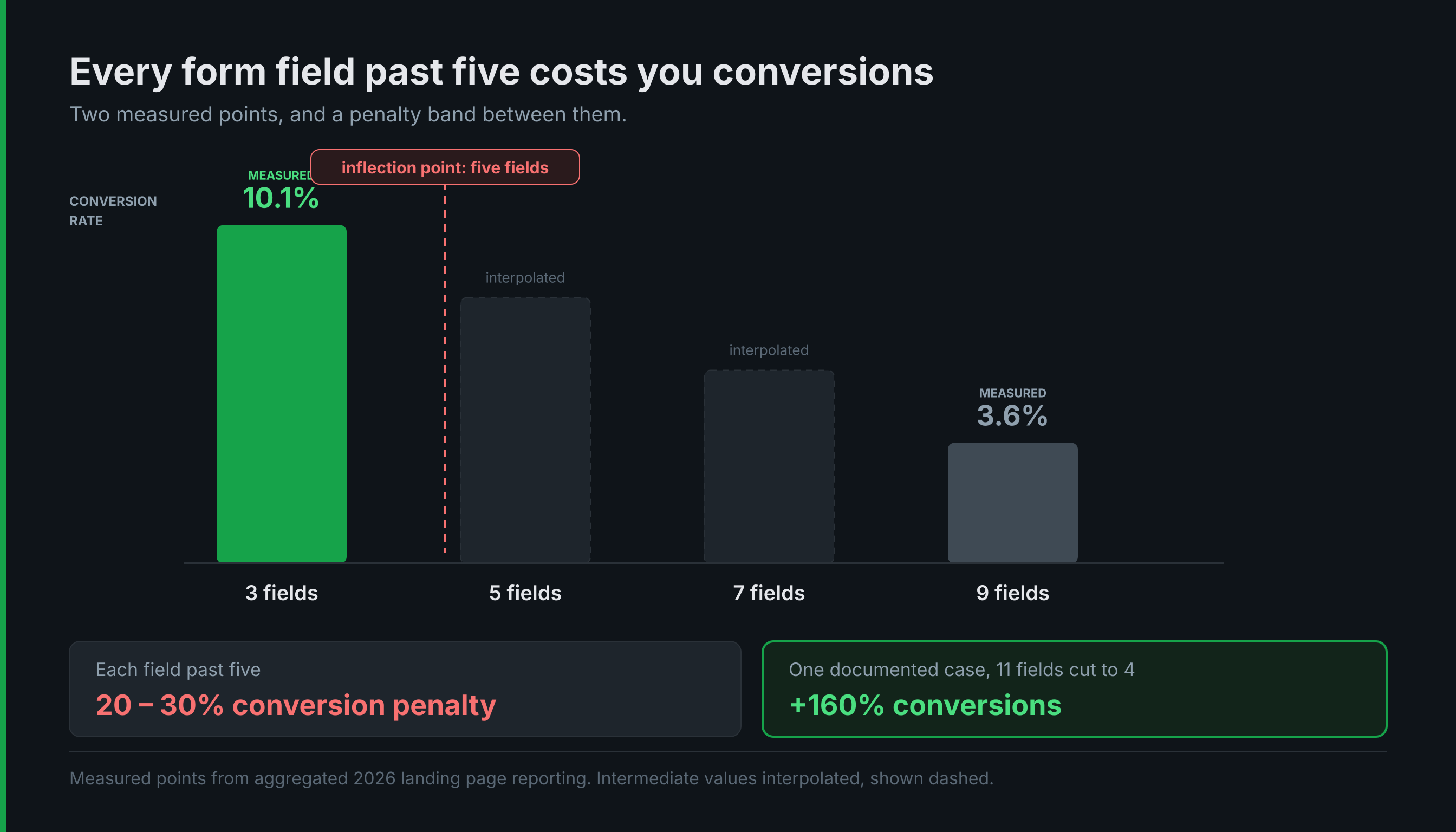
Three-field forms convert at roughly 10.1%. Nine-field forms drop to about 3.6%. Every field past five carries somewhere around a 20% to 30% conversion penalty. One documented case cut a form from eleven fields to four and saw conversions increase 160%.
Now the honest counterargument, because there is one and it deserves a real answer. Fewer fields means more leads and lower average lead quality. Sales teams hate this, and they're not being unreasonable. Nobody wants to spend their morning calling people who were never going to buy.
The resolution is to qualify after the form rather than inside it. Collect name, email, phone, and one qualifying question. Ask everything else on the call, in a follow-up email, or through progressive profiling later.
The logic is simple: you cannot qualify someone who never submitted. A nine-field form doesn't filter out bad leads so much as it filters out impatient good ones, and impatient people with money are a large share of your market.
Fields worth interrogating specifically: company size, job title, budget range, "how did you hear about us," and anything that exists because someone in 2021 wanted a report they no longer read. That last category is bigger than most teams expect.
Fix 3: the ask is too big for the traffic
"Request a Demo" and "Talk to Sales" are high-commitment asks. They work well for warm traffic and underperform badly on cold paid clicks.
The fix is to reframe the call to action around what the visitor receives rather than what you receive. Not a meeting for you, an answer for them.
Some swaps that tend to work:
For B2B services, "Request a Demo" becomes "Get a Scoped Estimate." For home services, "Contact Us" becomes "Check Availability in Your Area." For considered purchases, "Learn More" becomes "See Pricing."
Match the size of the ask to the temperature of the traffic. Branded search can carry a heavy ask, because those people already decided to look you up. Broad discovery traffic cannot.
The clearest signal that your ask is too big: healthy traffic, decent time on page, and almost no form starts. That pattern means people are interested and unwilling. Interested and unwilling is a solvable problem. Uninterested is not.
Fix 4: proof, positioned where the doubt is
Most pages collect every testimonial into one block near the bottom, well past the point where the visitor already decided.
Put proof next to the specific objection it answers instead. Worried about price? Put a testimonial about value near the pricing section. Worried about whether you're legitimate? Put licenses and certifications near the form. Worried you'll take three days to respond? Put a review that mentions fast response time right next to the button.
For mid-market buyers, the proof that actually moves people, roughly in order: named case results with real numbers, third-party review scores, recognizable client logos, and industry credentials. Generic five-star pull quotes with a first name and last initial are close to noise at this point. Everyone has those, and everyone knows everyone has those.
One adjacent note: review schema markup can surface star ratings in search results, which lifts click-through rate on the organic side of the same page. Worth handling as part of your broader technical SEO work rather than as a conversion project.
Fix 5: speed and mobile
Short section, because this is table stakes and you've read it elsewhere.
What's actually worth checking: load the page on a real phone on cellular data rather than office wifi. Can you reach the form without pinch-zooming? Is the phone number tap-to-call? Is the primary call to action visible without scrolling on a mid-size phone?
The single highest-leverage mobile fix we deploy at this budget level is a sticky call-to-action bar pinned to the bottom of the screen. It's cheap, it takes an hour, and it reliably helps.
What to test first, and how to test it honestly
Order your work by effort against likely impact. Form fields first, because it's the cheapest change with the best-documented effect. Then call-to-action copy. Then headline and message match. Then proof placement. Then layout. Design refresh last, which is the opposite of the order most teams choose.
Change one thing at a time or you learn nothing about what worked.
Now the part almost nobody will tell you honestly. At 50 conversions a month, you cannot run a statistically valid A/B test on a button color. The math doesn't support it and no amount of enthusiasm changes that. Below roughly 100 conversions a month, the practical approach is to make one substantial change, run it for a full month, and compare periods while acknowledging that you're accepting some noise. Pretending you have significance you don't have is how teams waste entire quarters chasing results that were random.
Two metrics worth tracking that most accounts don't: form starts versus form completions, which isolates whether the form or the page is the problem, and scroll depth to your primary call to action. If people never reach the button, the button copy isn't your issue.
Worth verifying before you trust any of it: that your conversion tracking is actually firing correctly. Testing against broken measurement produces confident wrong answers, and it's more common than you'd think.
Bottom line
You've almost certainly spent more time on bid strategy this year than on the page your clicks land on, and the page is the lever without a ceiling.
Start with the form. Count the fields. Cut to five or fewer. Move the rest of the qualification to the phone call. That one change is usually worth more than a quarter of bid tuning, and you can ship it this week.
If your traffic looks fine but your conversion rate doesn't, the page is where to look. We handle landing page design and development as part of our paid media work, and we're happy to take a look at what's converting and what isn't before you commit to anything.
