

You've probably heard that creative is the new targeting. With Meta's algorithm increasingly handling audience selection automatically, the quality and relevance of your ad creative has become the primary factor determining whether your campaigns succeed or fail.
But here's the good news: you don't need a Hollywood production budget or a full creative team to make effective Meta ads. The best-performing ads in 2026 are often simple, authentic, and created with tools most small businesses already have access to.
Let me walk you through what's actually working in Meta creative right now and how to create effective ads without breaking the bank.
The Meta Creative Landscape in 2026
The platform has evolved significantly in how it evaluates and serves creatives. Here are the biggest things we are focusing on with our clients internally this year in 2026:
Redefining What “Good Creative” Means
How Meta's algorithm prioritizes creative quality has shifted from just engagement metrics (clicks, likes, comments) to predicted conversion potential. The algorithm analyzes your creative assets and predicts which combinations will drive your optimization goal. Better creative gets more delivery and lower costs.
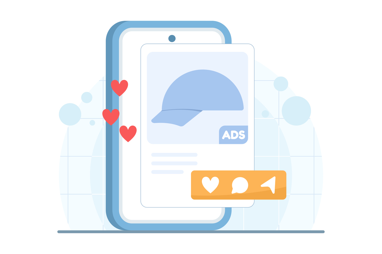
Creative > Targeting
The shift from targeting precision to creative resonance reflects Meta's move toward Advantage+ and broad targeting. When you can't narrow your audience to "women 35-44 who like yoga and live in specific zip codes," your creative must do the work of attracting the right people and repelling the wrong ones. Creative has become your targeting mechanism.
Intentional Creative For ALL Formats
Platform evolution across Feed, Stories, and Reels means you need creative that works in multiple formats. Feed ads can be square or landscape. Stories and Reels require vertical video. Your creative strategy needs to account for where ads will actually appear, not just where you think they'll appear.
The Great Creative Debate: What's Actually Working Now?
There's no universal answer, but there are clear trends we’re noticing.
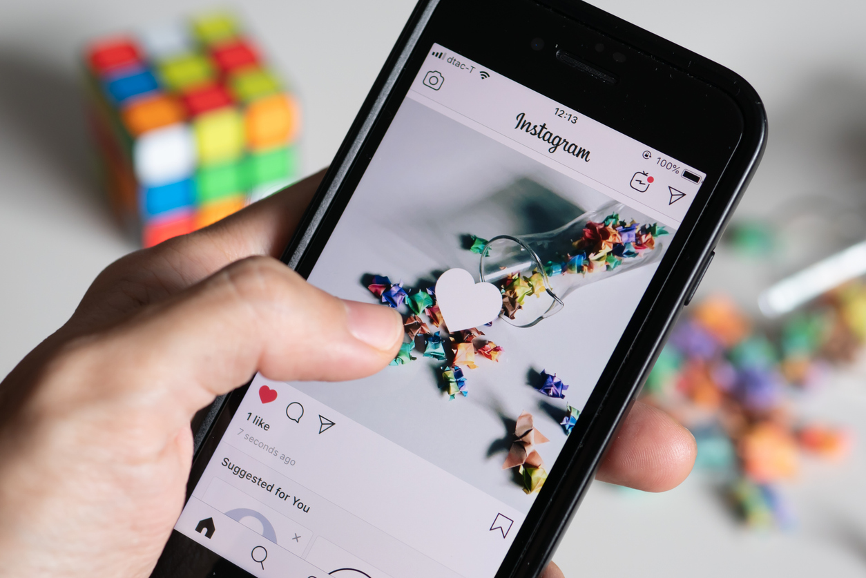
User Generated Content (UGC)
UGC-style ads continue to outperform polished brand content in many tests. Ads that look like they were filmed by a real customer on their phone often generate higher engagement and conversion rates than professional productions. The authenticity resonates more than production value.
Professionally-Produced Content
Polished brand content still has its place, especially for premium brands, luxury products, or when you're building brand awareness rather than driving immediate conversions. Beautiful product photography and professional video have their place - just not exclusively.
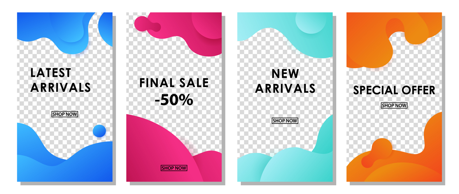
Static Images Making a Comeback
Static images vs. video is where we're seeing interesting data. Video was supposed to dominate everything, but static images are making a comeback. In many accounts, simple product photos or text-on-image designs are outperforming video content. The hypothesis is that video is overwhelming and static images are easier to process quickly.
Matching Ad Formats To Campaign Objectives
Current performance trends by format show vertical video (Reels, Stories) performing extremely well for engagement but not always conversion. Square images and video perform consistently across placements. Carousel ads often deliver the best conversion rates because they allow for storytelling and multiple product views.
The Resurgence of Static Image Ads
While video is still the most commonly recommended creative type we implement in our clients’ campaigns, don't sleep on simple images - they're working better than many expect (including ourselves).
Why are images making comeback?
Why simple images are outperforming video in many tests comes down to attention economy. Users are scrolling fast. A clear, simple image with a compelling headline can communicate value instantly. Video requires watching for several seconds to understand the offer. In a world of short attention spans, simplicity wins.
Load times and user experience advantages favor images over video. Images load instantly, even on slower connections. Video requires buffering, starts with sound off (requiring captions), and takes longer to communicate the message. For direct response campaigns, images often convert better because they get to the point faster.
On our clients’ side, we often get a sign of relief when static ads outperform video. Lower production costs and faster iteration make images more practical for small businesses. You can create 10 image variations in the time it takes to produce one video. This faster iteration means you can test more creative angles and find winners quicker.
In what situations do static images work the best with Meta Ads?
When static images work best is typically for straightforward offers, product showcases, limited-time promotions, and simple value propositions. If your offer can be communicated in a headline and a product photo, video might be overkill.
Design principles for high-performing static ads include: bold, contrasting colors that stand out in feed, clear focal point (one main thing to look at), minimal text on image (headline and description do the heavy lifting), faces or people when appropriate (humans attract attention), and clear branding without being overwhelming.
User-Generated Content (UGC) Style Ads
UGC-style creative continues to dominate performance in many categories.
What’s the psychology around UGC ads?
Why UGC-style ads outperform polished content is authenticity. When an ad looks like it was created by a real customer sharing their experience, it doesn't trigger "ad blindness." It looks native to the platform. People trust peer recommendations more than brand messaging.
What if my customers won’t go on camera?
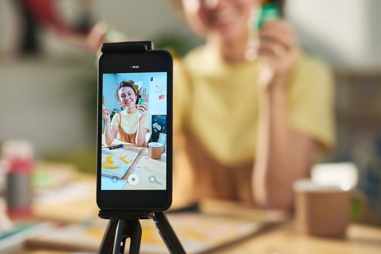
Creating UGC-style content without actual customers is possible. You can create this style yourself (filming on your phone, casual setting, natural speaking), hire UGC creators (freelancers who specialize in this style, much cheaper than traditional influencers), or encourage actual customers to create content in exchange for discounts or products.
You can often times find these UGC creators at an affordable cost on platforms like Upwork or Fiverr where creators charge $100-300 per video. This is much more affordable than traditional influencer marketing or production companies, and often performs better.
What industries are you seeing UGC not work so well?
We are seeing professionally produced video work better than UGC for our clients that represent luxury brands, B2B services, professional services requiring high trust, or products where polish and prestige are part of the value proposition. A luxury watch brand probably shouldn't use shaky phone footage.
Carousel Ads: Underutilized and Effective
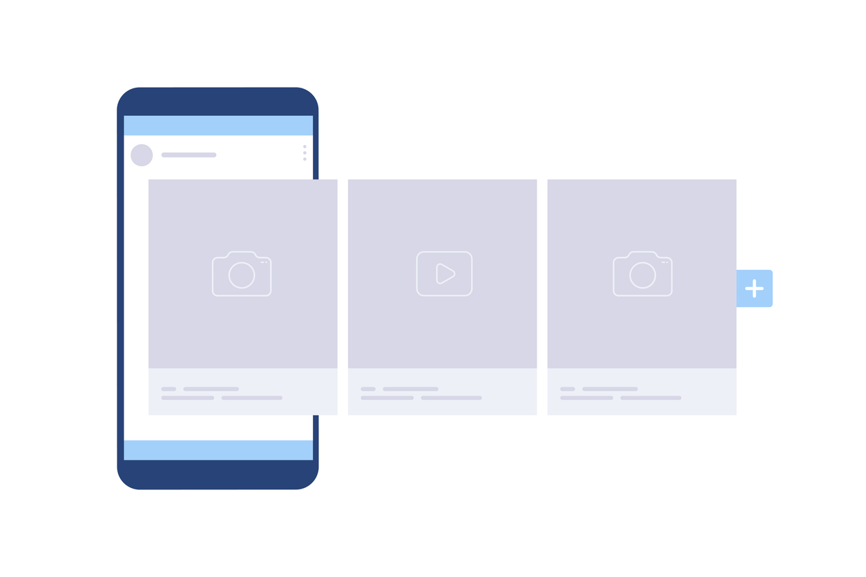
Carousel ads let you showcase multiple images or videos in one ad and more importantly, tell a visually engaging story without all the production costs of video.
The psychology behind Carousel Ads
Why carousel ads often outperform single image/video is because they tell a story, show multiple products or benefits, provide proof through before/after sequences, and allow for direct comparison. They also take up more space in feed, making them more noticeable.
What are some creative ways to use Carousel Ads?
Creative strategies for carousel formats include: product showcases (5-7 products), before/after transformations (2-3 stages of progress), step-by-step processes (how it works), feature highlights (different benefits per card), social proof (testimonials or reviews per card), and comparison (your product vs. alternatives).
Product showcases vs. storytelling approaches both work, depending on your goal. E-commerce can show multiple products to increasethe chance of relevance. Service businesses can tell a story across cards, building interest card by card.
Can you offer any design tips for my Carousel Ads?
First, based on our data, the optimal number of cards is three to five. This provides enough variety without overwhelming. Two cards are too few, whereas ten cards are too many (people won't swipe through all of them). The sweet spot of three to five gives you room to tell a story without losing attention.
Design consistency across carousel cards matters for polish. Use the same design template, color scheme, and font across cards to create a cohesive look. Each card should work standalone (not everyone swipes through), but also connect to create a narrative.
Vertical Story & Video Ads
These placements require specific creative considerations.
Don’t fit a landscape peg in a portrait-sized hole
Vertical format optimization: 9:16 ratio is mandatory for Stories and Reels. Don't try to repurpose square or horizontal creative - it won't fill the screen properly. Shoot or design specifically for vertical placements.
Sound on..and off
Making sound-off videos work requires text overlays, captions for all spoken content, and visual storytelling that makes sense without audio. Assume everyone is watching with sound off and design accordingly.
Native vs polished content
Native content style vs. "this is an ad" style shows different performance by objective. For awareness, native-feeling content that blends into Stories/Reels performs well. For direct response, slightly more polished content with clear offers and CTAs often converts better.
Go easy on the interactive elements
Interactive elements like polls and stickers are available in Stories ads but see mixed results. They increase engagement but don't always improve conversions. Test them, but don't assume they're necessary.
Be intentional about resizing
Cross-posting strategy across placements requires creating variations of your creative. You might have one version optimized for Feed (square), one for Stories (vertical with different text placement), and one for Reels (vertical with native content style). Don't just use the same creative everywhere.
Creative Elements That Matter Most
Focus on these fundamentals before worrying about advanced techniques.
Focal points
Visual hierarchy and focal points direct attention. The most important element (product, face, offer) should be the largest and most prominent. Secondary elements should support, not compete for attention. One clear focal point performs better than cluttered designs.
Brand psychology
Color psychology and brand consistency affects perception. Use colors that align with your brand but also stand out in feed. High contrast (bright colors against dark backgrounds or vice versa) stops the scroll. Consistent use of brand colors builds recognition over time.
Text usage
Text overlays: How much is too much? The old "20% text rule" is gone, but the principle remains - less text is usually better. Use text overlays to highlight key benefits or create curiosity, but don't try to tell the entire story in image text. That's what your primary text and headline are for.
Calls-to-action
Call-to-action clarity and placement should be unmistakable. If you want them to "Shop Now," say that clearly in the text overlay, primary text, and CTA button. Don't make them guess what action to take.
Mobile-first
Mobile-first design principles are essential since 98% of Meta users access on mobile devices. Large text that's readable on small screens, tap-friendly buttons, vertical or square formats that fill mobile screens, and simple designs that aren't cluttered on small displays.
Writing Ad Copy That Converts
Creative isn't just visual - copy matters enormously. Look past what looks pretty, and focus on the core messaging and offer. This will make or break your campaigns. Below are some tips for writing successful ad copy to complement your creative strategy.
Hook em’ fast
Primary text best practices: hook in first sentence because only the first 125 characters show before "see more." Your first sentence needs to stop the scroll. Use pain points, curiosity, bold claims (that you can back up), questions, or provocative statements.
Keep it short
Headline optimization: short and benefit-focused should be 5-7 words max. "Get Clear Skin in 30 Days" beats "Revolutionary Dermatologist-Formulated Skincare System." Focus on the outcome, not the features.
Match your CTAs
Call-to-action button selection should match your offer. "Shop Now" for e-commerce, "Learn More" for lead gen, "Sign Up" for app installs or services, "Contact Us" for local businesses. Test different CTAs - they affect conversion rates.
Don’t default to emojis
Emoji use: Helpful or tacky? depends on your brand and audience. B2C brands targeting younger audiences can use emojis to add personality. B2B brands or targeting older audiences should probably skip them. Test both ways.
Offers and Hooks That Stop the Scroll
What you say is as important as how it looks. Here are some proven examples of hooks and offers you can use in your creative.
Discounts
Discount-based hooks: when they work, when they hurt is that discounts drive volume but can train customers to wait for sales and erode margins. Use discounts for customer acquisition on proven products, but avoid them if you're building a premium brand or if your margins don't support it.
Problem-solution offers
Problem-solution frameworks work well for most categories. State the problem clearly ("Tired of back pain ruining your sleep?"), then position your product as the solution. This resonates because it starts with their pain point.
Piquing curiousity
Curiosity gaps and intrigue can work if you deliver on the promise. "This weird trick helped me lose 20 pounds" might get clicks, but if your product disappoints, you've wasted money. Use curiosity honestly.
Testimonials
Social proof and testimonials build trust and improve conversion rates. "Over 10,000 five-star reviews" or "See why people call this the best..." or actual customer testimonial quotes. Proof beats claims.
Urgency
Time-sensitive vs. evergreen messaging both have their place. Time-sensitive ("Sale ends Friday") creates urgency but requires updating creative. Evergreen ("Transform your skin in 30 days") doesn't create urgency but doesn't expire. Mix both approaches.
Platform-Specific Creative Considerations
Different placements need different creative.
Facebook vs Instagram
Facebook Feed vs. Instagram Feed differences are subtle but real. Instagram users skew younger and expect higher visual quality. Facebook users are more receptive to longer copy and detailed explanations. Same brand, slightly different creative approach.
Stories vs Reels
Stories vs. Reels unique requirements mean Stories can be more static (text-based designs with no motion work fine), while Reels need movement and native content style to perform. Reels are competing with organic Reels, so your ad needs to feel like content.
Audience Network
Audience Network creative specs usually means your Feed creative will show on external websites and apps. Keep designs simple and messages clear since context might be lost on external placements.
Messenger Placements
Messenger placement optimization requires conversation-focused creative since the goal is getting people to message you. Use conversational copy, questions, and clear invitations to start a chat.
In-stream Videos
In-stream video creative differences for video ads in the middle of longer videos need to grab attention immediately (people are waiting to get back to their content) and communicate value quickly (they'll skip if possible).
What Not to Do: Common Creative Mistakes
Avoid these pitfalls that tank performance.
Too much text
Too much text on images still matters even though the 20% rule is gone. Meta doesn't reject text-heavy images anymore, but performance suffers. The algorithm deprioritizes ads with excessive image text. Keep text minimal for better delivery.
Bad quality
Poor quality images or videos in 2026 are inexcusable when phones shoot 4K. Blurry, pixelated, poorly lit, or awkwardly cropped creative signals low-quality business. Even if your product is great, bad creative makes people doubt you.
Poorly written hooks
Misleading hooks that hurt conversion rates might get clicks but waste money. "You won't believe what happened next" followed by a disappointing product destroys trust and conversion rates. Hook with truth, not deception.
Stock photos
Generic stock photos that look like ads trigger immediate scroll-past. The cheesy business handshake photo, the woman laughing with salad, the generic office setting - these scream "ADVERTISEMENT" and get ignored. Use specific, unique imagery.
Ignoring mobile-first
Ignoring mobile viewing experience is a fatal mistake when 98% of users are on mobile. Text too small to read, important details cut off in square crop, tap targets too small, or designs that only look good on desktop all hurt mobile performance.
AI-Generated Creative: Should You Use It?
AI creative tools are everywhere. Here's when they make sense.
Meta’s in-platform tools
Meta's AI creative tools: Advantage+ creative automatically tests variations of your creative by adjusting brightness, contrast, and creating variations. It works okay but isn't magic. Test it by running some ads with it on and others with it off to see if it helps your account.
Third-party AI image/video generators
Tools like Midjourney, DALL-E, or Runway can create custom imagery or video. They're improving rapidly but still have limitations (weird hands, uncanny valley faces, licensing questions). Use them for concept testing or backgrounds, not primary product photography.
Productivity, not perfection
Quality concerns and brand consistency are valid with AI-generated content. AI can create quantity, but quality and brand alignment require human oversight. Use AI to speed up creation, but review and refine everything.
Know when to use AI, and when not to
When AI creative works and when it fails is that AI is good for generic imagery, concept exploration, and background elements. It fails at accurate product representation, authentic human emotion, and anything requiring precision. Use it as a tool, not a replacement for human creativity.
Nothing replaces the human touch
The human touch still matters for strategy, messaging, brand voice, understanding your audience, and quality control. AI can help you create faster, but it can't replace understanding what your specific customers need to hear.
Creative Strategy by Business Type
Different businesses need different creative approaches.
E-commerce
Product showcases vs. lifestyle both work depending on product type. Fashion and home goods need lifestyle imagery showing products in use. Electronics and tools need clear product showcase showing features. Test both, but know your category norms.
Local Services
Before/after vs. process videos both build trust. Before/after transformations (landscaping, remodeling, fitness) provide instant proof. Process videos (how we repair, what we do, day in the life) build credibility and trust. Use both in your mix.
B2B Services
Educational content vs. testimonials balance value and proof. Educational content (tips, insights, expertise) attracts attention and builds authority. Testimonial videos from real clients build trust and overcome skepticism. Lead with value, close with proof.
Restaurants
Food photography that sells requires good lighting, close-ups showing texture and freshness, strategic plating, and context (people enjoying food, not just food on white background). Make viewers hungry.
Professional Services
Building trust through creative requires showing the people behind the business (faces build trust), sharing client success stories, demonstrating expertise through mini-tips or insights, and professional presentation that signals competence.
Building a Creative Production System
One of the keys to success when it comes to running scalable Meta campaigns in the long run is in building systems for optimization, creative, and campaign analysis. For the purposes of this article, here are some tips on systematizing your processes to ensure you’re not running into ad fatigue and you always have new creative on deck.
Build in batches
Monthly content creation batches are more efficient than creating one ad at a time. Block 4 hours one day per month, batch create 15-20 variations using templates and frameworks, and you have a month's worth of creative ready to deploy and test.
Repurpose
Repurposing content across campaigns maximizes the value of every asset. That product video you shot for Meta? Also use it in Google ads, on your website, in email campaigns. The photoshoot you did? Generate 20 variations with different text overlays.
Automate your UGC collection
User-generated content collection processes systematically gather content from customers. Email customers after purchase requesting reviews and photos, offer small incentives for video testimonials, create a branded hashtag customers can use, and monitor social mentions for content you can repurpose (with permission).
Plan 90 days in advance
Content calendar for seasonal variations plans creative in advance. Know you need back-to-school creative in July, holiday creative in October, and New Year's resolution creative in December. Plan and produce these early so you're ready to deploy on schedule.
Great Creative Is Your Competitive Advantage
In 2026, targeting is increasingly automated. Bidding is automated. What's left to differentiate your ads? Creative.
Start simple with basic product photos or phone-shot videos. Test consistently - every 2-4 weeks, try 3-4 new variations. Scale what works by increasing budget on your winners and creating variations of winning concepts.
Authenticity beats polish in most cases for small businesses. Don't try to look like a Fortune 500 brand if you're a local service business or small e-commerce shop. Embrace authenticity, show real results, feature real people, and communicate genuinely.
If you need help developing a creative strategy or want feedback on your current ad creative, schedule a consultation with our team. We'll review what's working in your account and recommend specific creative improvements.