Learning Hub | Google Analytics
A Crash Course: How to Make Your Website Responsive
September 9, 2015 | Jon Teodoro

Before Michael Bay and Megan Fox jumped into the mix, the Transformers universe regularly broke the laws of science by morphing everyday vehicles into disproportionately enormous, flying robots. Using the magic of CGI, the recent live-action movies now strive for Transformers designs that are functionally plausible – unlike a sizable chunk of their plots.
When it comes to taking an existing entity and reconfiguring it to seamlessly shapeshift and function in different manners, we can’t help but point out some similarities in this process to the mobile first approach of mobile design. So how can this help you improve your existing website?
Step 1: Less Crap = Optimized Function
Before anything, be prepared to part ways with the non-essentials of your website. Mobile first is about drawing up new architecture and stripping away aspects of your site that, while they may have had immense value on a desktop version, only serve as obstructions in the mobile format. In other words, you’re going to have to leave some of the good stuff behind. Unconsolidated groups of links, image gallery archives, and a second set of analytics with an extra non-optimized mobile version of your site will drag down both user experience and attention span.
Step 2: Plan, Develop , and Execute A Digital Blueprint
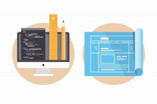
Responsive websites ideally have a more intuitive architecture that not only helps users navigate your site efficiently on mobile formats; it also reduces overall redesign costs, enhances analytics data insight, and can even drive up your business’ ROI. A blueprint in construction is synonymous to the wireframes that designers and developers create with software like Bootstrap, Balsamiq, and Zurb. Either through in-house or outsourced developers, implementing mobile first responsive web architecture to revolutionize your site has several advantages.
Step 3: REBRAND!
To fondly quote Agent J from the Men In Black series, follow what we just told you and you’ll have a working site; deliver with some excellent branding and you’ll have the “new hotness.” Your website may have been the bomb-diggity back in 2010, but Blackberrys, the Jonas Brothers, and Netflix’s DVD delivery service were also relevant back then. It’s not so hard to imagine that people in 2015 care more about how accessible your site is on their tablets and phones (let’s hope they’re not driving).
But don’t ignore the opportunity to rebrand for your site (great responsive example here). Logos, interactive menus, and gripping content are elements that will make your website great. Juggling all of that into a cohesive product that will reinvent how your visitors envision your company, brand, and/or mission will make your website one-of-a-kind.