Learning Hub | Website Design Inspiration
5 Excellent Examples of Mobile Web Design: Best Practices for 2017
April 21, 2017 | Jon Teodoro

Your Audience is on the Move. You Need to Catch up.
In our increasingly mobile world, everyone and everything is constantly connected, often through thin, light, palm-sized devices.
Thanks to incessant mobile innovations, your target audience members (along with everyone else) are on the move. If you want their eyes on your site, then it needs to be able to go where they go.
Enter responsive, mobile-friendly web design.
A responsive site adjusts to fit the size of the screen on which it is being viewed. This means that one design can scale to fit desktops, laptops, tablets, smartphones, etc.
Responsive websites not only increase audience engagement, but they are favored by Google algorithms and return higher than non-responsive sites on search engine results pages.
In short, if you want to increase your site traffic, optimize end user experience and grow your business, you must invest in a responsive website.
Want to see excellent responsive web design in action? We’ve gathered five great examples. Take a look.
Successful Mobile-Friendly Design Examples We Love
Etsy
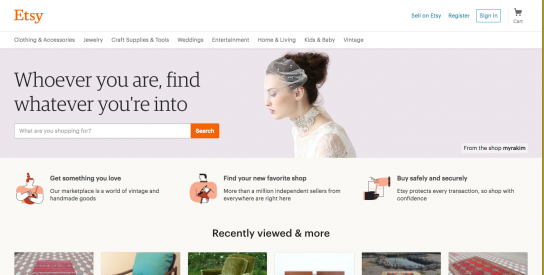
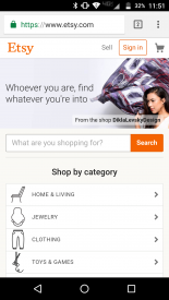
Well-known online retailer Etsy offers a great example of responsive web design with its simple, clean mobile site.
Once on the home page, users can easily sell, sign in to a personal account or check and see what is in their cart.
There’s a nice headline and image combo, but Etsy designers were smart in not investing too much in a dynamic header. After all, what is likely the first step their customers want to take?
Search.
They’ve provided a big, clickable, easy-to-find search bar smack dab in the center of the screen. For users who want to browse and don’t have a specific product in mind, Etsy provides the “shop by category” secondary search feature.
This mobile design is successful because it directly caters to specific customer needs and next steps. It also shows that you don’t have to have a 360 video or awe-inspiring imagery on your mobile site’s home page to be successful at pulling customers in.
HEADSPACE
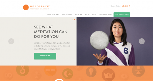
Get your mind right! That’s what HEADSPACE is all about.
This meditation platform not only provides awesome resources in the fashion of fun, informative infographics, explanatory videos and cutie-cute animations, but it provides a dynamic, interactive user experience that is so simple.
We love the overall design of this mobile site. The clean, friendly font and use of blank space and borders makes for an inviting site.
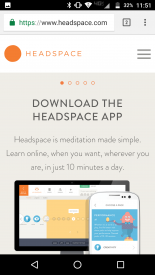
HEADSPACE designers knew they needed to make possible meditators feel at home instantly with every aspect of their design. After all, how could you declutter your mind with a cluttered platform?
If you compare the desktop and mobile versions, you see that no branding, imagery or personality was sacrificed in the smaller space.
The use of a slider makes it possible for the site to convey more info in less space, and the copy is straightforward. Better yet, it quantifies the time a user will need to spend in order to see results….only 10 minutes a day.
Bravo, HEADSPACE!
National Public Radio: NPR
We’ve used NPR in examples of web design in the past because they nail it. (And no, we are not using this platform to advocate for NPR in any area other than design.)
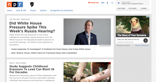
As far as news sites go, we love NPR’s clean design and use of borders, blocks and grouping.
Users can immediately see where each story starts and stops. Headlines, images and brief text illuminate the reader as to what they can expect to read should they click on a story.
The use of bullets to show similar stories is a nice touch, and they don’t get carried away with providing the user too many options by linking to just one other story.
We can’t help but love the cute custom radio icon in the top right that allows the viewer to listen to their local station provider live right from their mobile device.
Overall, NPR is a great example of simple, clean, straightforward mobile design that gets right to the point.
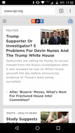
An interesting thing to note is that NPR didn’t use up space on mobile to provide a donation CTA above the fold like they do on the desktop version. Not sure the reasoning behind this, but we don’t mind it.
Chances are mobile users are loyal audience members already, which increases the likelihood that they will donate of their own volition without being prompted to do so on every single platform.
Pencils of Promise
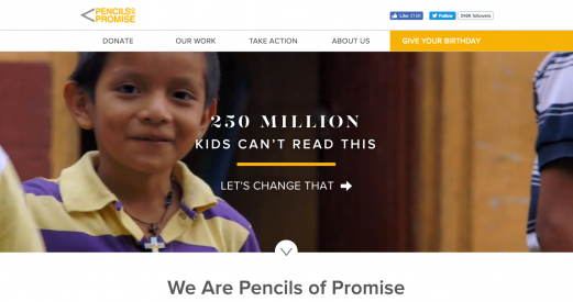
Pencils of Promise offers a superb example of responsive design for the nonprofit sector. This organization is dedicated to bringing quality education to every child by building schools, programs and global communities.
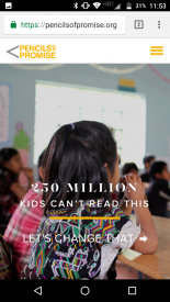
On the desktop version, what you cannot see is that the background image is actually a video – an awesome storytelling tool. However, video technology like this is not yet available on mobile so designers replaced it with a stagnant image.
The image tells a story though. Immediately, visitors will recognize a child in a classroom.
We love the gripping copy, which presents a problem, offers evidence in the form of a statistic and provides a solution with a call to action in under 10 words.
Copy is truly the cornerstone of this excellent mobile site. Scrolling further, visitors find out:
- The mission
- Stats
- Progress
- How to Donate
- Solutions
- About the Community
Succinct copy gets to the point while powerful images and icons tell stories. By the time users get to the first CTA, they have everything they need to be compelled to donate.
Qdoba
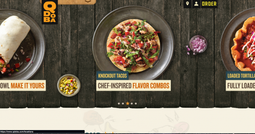
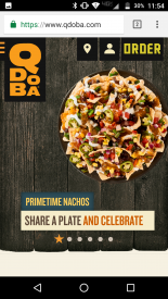
We’re behind any design that appeals to our taste buds right off the bat. Nachos, ya kiddin’ me?
Qdoba knows how to get their customer right where they want them – hungry.
This site makes use of mouthwatering food photos in a slider format, and we love the wood background and cool logo/menu combo on the left.
The simple icons up top show users they can locate a restaurant, sign in or place an order. Not using words to present this info is a smart choice because there is nothing distracting viewers from the tasty platters dancing before their eyes.
It’s almost lunch time here…tacos it is!
Go Mobile With Verde Media
We design responsive websites for our customers because we believe they’re an investment worth making.
After launching a responsive site, our customers see increased traffic and audience engagement, which leads to business growth and quick ROI.
Our picks above, all from different companies in diverse industries, provide excellent examples of successful mobile web design. Though they differ, they all have one thing in common. They kept their customers in mind when it came to design.
This is CRUCIAL because people on mobile are often ready to take action, browsing with intent.
When you’re ready to go mobile, ask yourself, “What is the first step that my customers want to take after landing on my site?”
Answer that correctly, and you’ll have the keys to the kingdom.