Learning Hub | Website Design Inspiration
Top 2018 Nonprofit Website Designs
January 2, 2018 | Jon Teodoro
Nonprofit organizations are all around us helping the world move and progress without us even realizing it at times. Many of us have given our money or time volunteering at organizations that inspire us. They build roots in our communities and our world, dealing in everything from climate change to blood.
We picked the following ten sites because they implemented web design (to their advantage) to achieve their goals – raising funds, raising awareness and/or drawing in users by sharing their mission beautifully.
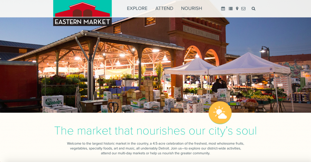
1. Eastern Market (https://www.easternmarket.com)
Why we like it: We started out by digging into some nonprofits that we have had personal connections with so it is no surprise that the first couple are local. Detroit’s biggest farmers market just rebranded its site with a clean design that presents beautiful full-page photos, consistent content identity and simple, yet informative navigation.
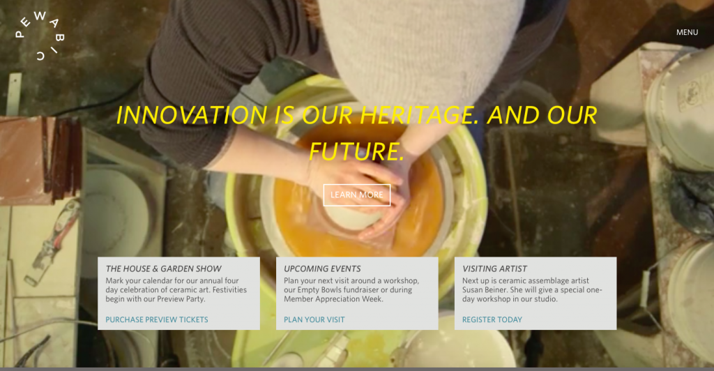
2. Pewabic (https://www.pewabic.org)
Why we like it: This nonprofit ceramic studio has connections just about everywhere in Detroit. The site’s large tagline pulls user focus directly to a call of action above the fold. The entire site uses a nice earthy font palette that coordinates with the photos and – the BEST part – that background is a video of a woman throwing clay. Intriguing, indeed.
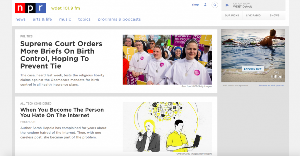
3. NPR (https://www.npr.org)
Why we like it: This site is the epitome of organization, which aids in its mission – getting news to people. The simple block format uses a lot of white space. The large headlines and use of white background, black text is reminiscent of traditional newspapers and makes the information groupings clear. We love the “On Air Now” button for quick listening in the top right.
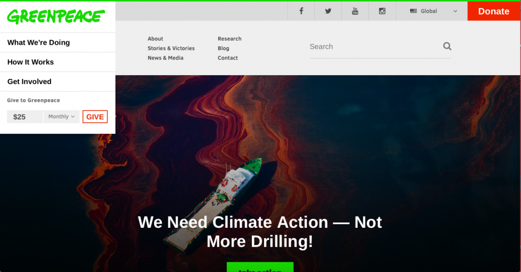
4. Greenpeace (https://www.greenpeace.org/usa/)
Why we like it: This very well known organization may not need much advertising, but it didn’t shy away from implementing beautiful web design with its users in mind. With large, high-def photos and easy-to-understand statistics, this site gets a lot of information across quickly and efficiently. We love the multiple calls to donate – especially the easy donate field above the fold where users can choose how much and how often they want to give money.
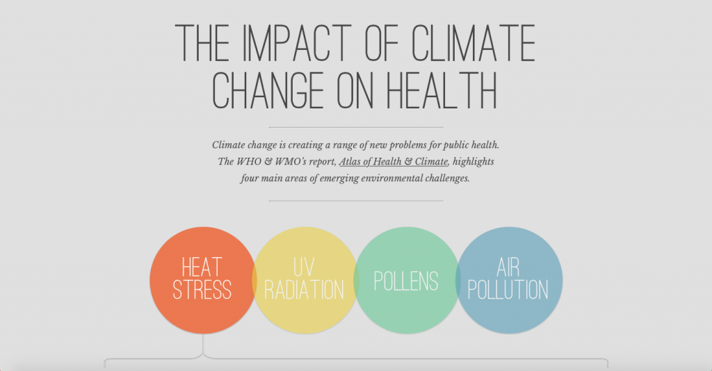
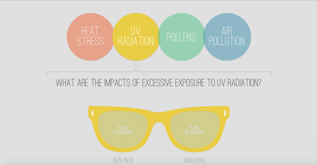
5. Under the Weather (https://undertheweather.eu)
Why we like it: Greenpeace may get the excess of information across efficiently, but this site gets climate stats across to users by asking them to interact. Take a scroll down the page, and you can learn several stats by clicking on sunscreen bottles, sunglasses and inhalers. This site may even be good for younger users that aren’t always enthusiastic about learning outside of school.
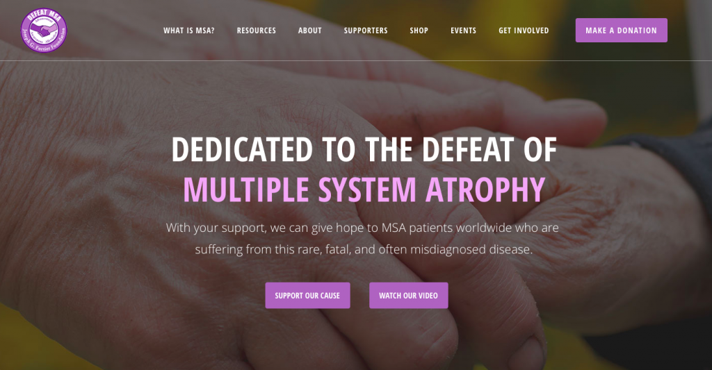
6. Defeat MSA (https://defeatmsa.org)
Why we like it: Defeat MSA uses straightforward content that gets to the point of its mission of helping those “suffering from this rare, fatal, and often misdiagnosed disease.” Nonprofits are often in the position of supplying difficult information, and this site does so while still feeling inviting with parallax scrolling, specifically designed icons and a latest news and updates section where users can learn all they need to before deciding whether to donate.
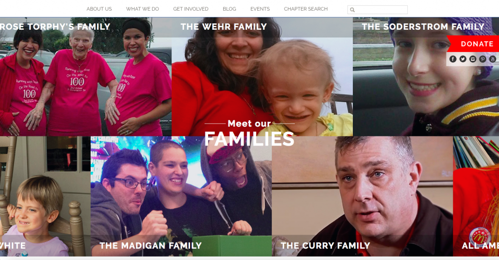
7. Ronald McDonald House (https://www.rmhc.org)
Why we like it: The highlight of this site is that it knows exactly the audience it is trying to reach – families of sick children. This site has many of the other features already discussed, but the section shown here is one where users can click and meet several families that have been helped by the RMH charities. There are also many opportunities to connect with social media icons and a newsletter signup field.
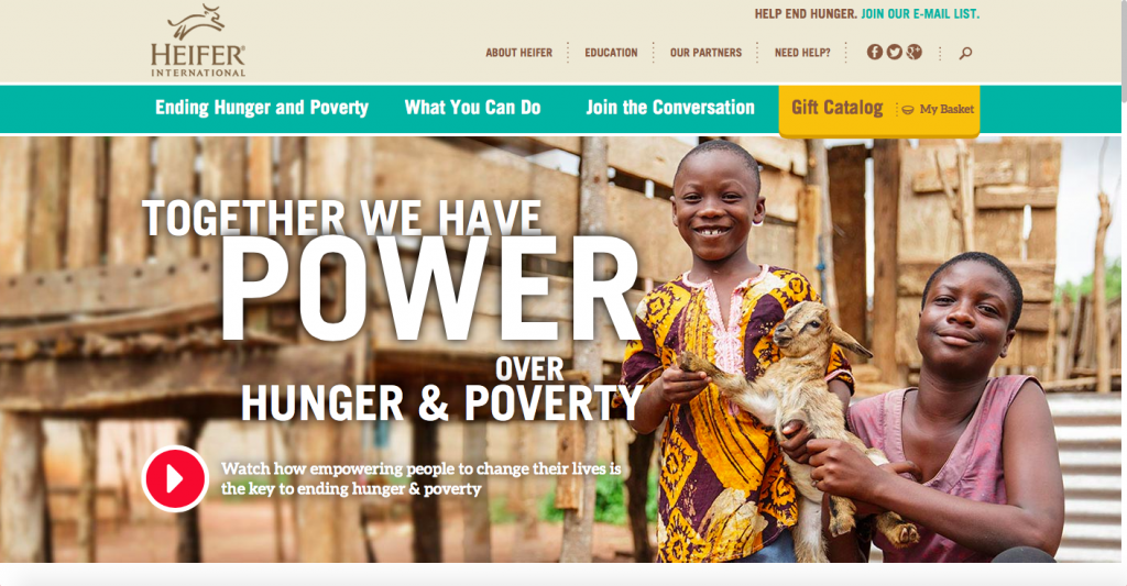
8. Heifer International (https://www.heifer.org)
Why we like it: This site uses beautiful photography better than any else we looked at and considering the subject matter, the photos are very important. There is a dynamic and unique slider that uses inspirational content, clean icons for easy navigation and infographics.
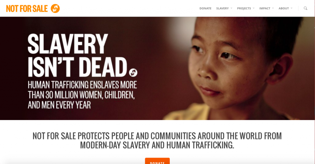
9. Not For Sale (https://www.notforsalecampaign.org)
Why we like it: This site does a good job of breaking down and explaining exactly what this organization does by breaking up its projects in the navigation and by including its yearly annual impact reports. NFS presents clear statistics and each block section of content has a call to action button.
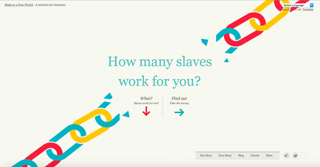
10. Slavery Footprint (https://slaveryfootprint.org)
Why we like it: This site is one big informative infographic, and we like it because it puts users right into the issue. You won’t just be reading facts and statistics, but you will be feeling them. Trust us. A few clicks on the animated and insanely well-designed survey and this site claims to tell you how many slaves are working for you. If getting people involved is the mission, this site nails it.
These nonprofits went above and beyond sharing their mission. We liked these sites because they chose to use web design to get across not only their organization’s goals, but sometimes tons of information.
There are some great examples on here of how to use infographics in place of content to summarize points that would be too cumbersome in text. There are some great examples of how to use photography and video to connect with users. Finally, there are some great examples of how to use design to elegantly place call to action buttons to raise awareness and funds without being intrusive or obnoxious to users.