Learning Hub | Website Design Inspiration
Top 2018 IT and Technology Website Designs
February 9, 2018 | Jon Teodoro

For many an average Joe, the terms “IT” or “tech consultant” send a flash alert through the brain and body. Warning: You are about to enter into territory that is way over your head. Ironically enough, consulting firms are there to guide you through that unknown territory and advise you on how to maneuver around unforeseen obstacles.
The following are our favorite websites from this industry because they present their mission in such a concise and user-friendly way that, not only will your forehead remain sweat-free and heartbeat in rhythm, but you’ll find yourself in awe of the gorgeous design as well.
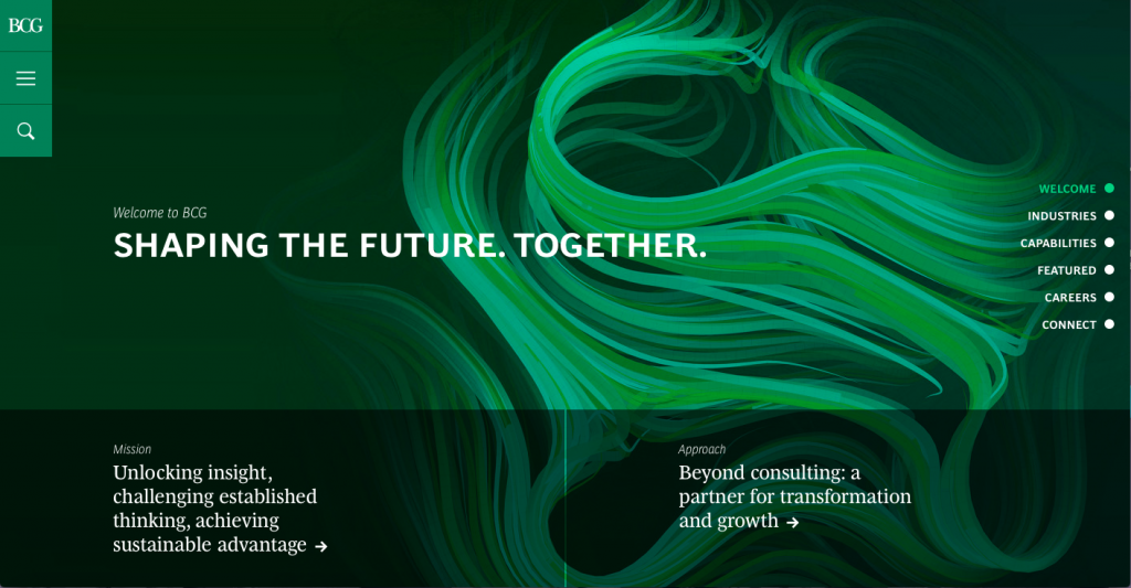
1. Boston Consulting Group (https://www.bcg.com)
What we like about it: Clean boxed layout with clear headlines and concise copy, beautiful full-page design and dynamic page scroll that incorporates sliders and links to specific information.
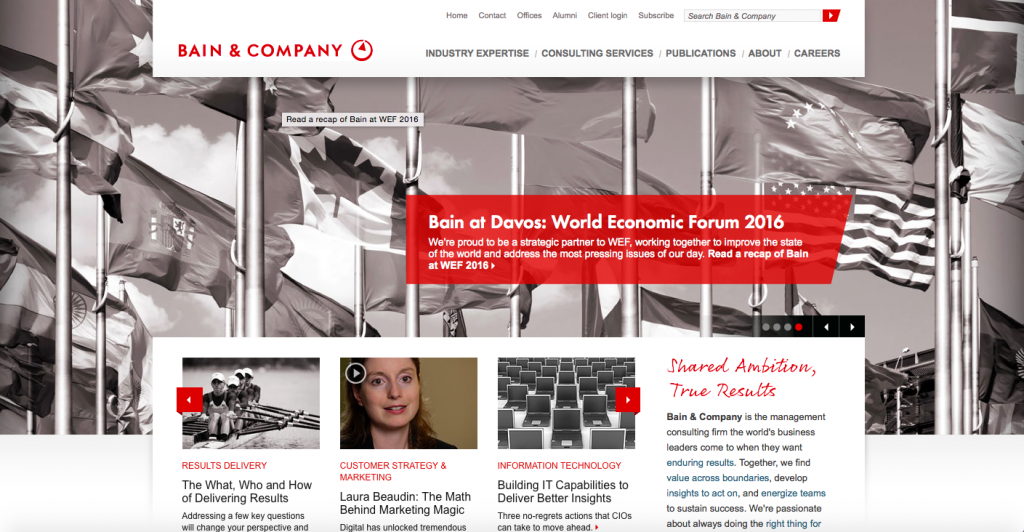
2. Bain & Company (https://www.bain.com)
What we like about it: Nice simple color scheme with grays and pops of red to direct attention. Navigation is clear at the top and they utilize infographics and a Twitter widget that shows they have an updated social media account.
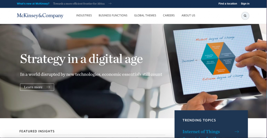
3. McKinsey & Company (https://www.mckinsey.com)
What we like about it: A design strategy that, while simple, does exactly what it needs to with clear navigation and concise content. We love the focus on a global mindset and the call to action – “Don’t just come to work. Come to change.”
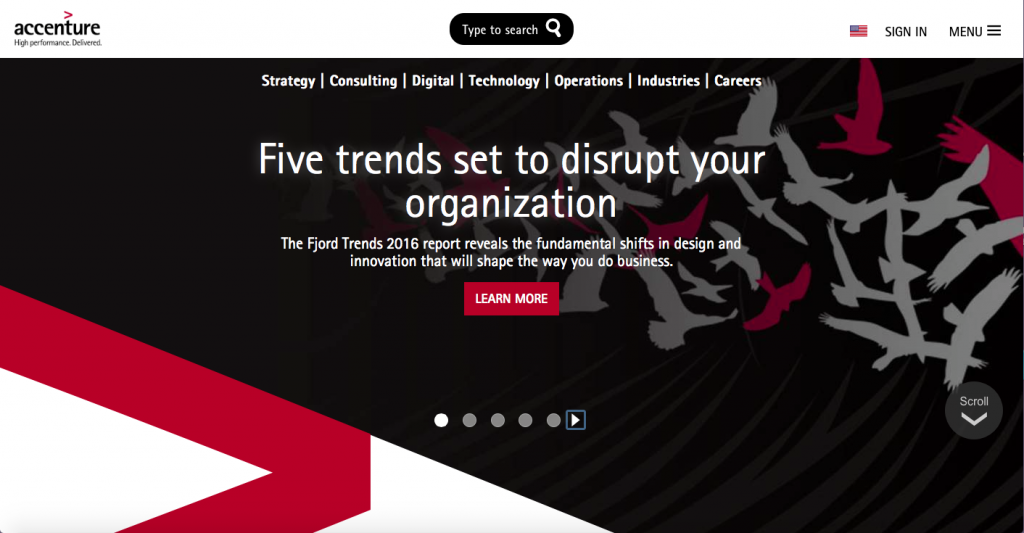
4. Accenture (https://www.accenture.com/us-en)
What we like about it: Full-page slider with pause and play button allows the user to be in control of the pace of information and utilizes high quality photos and video. The search bar, top center, makes for an efficient way to get directly to what you want without navigation.
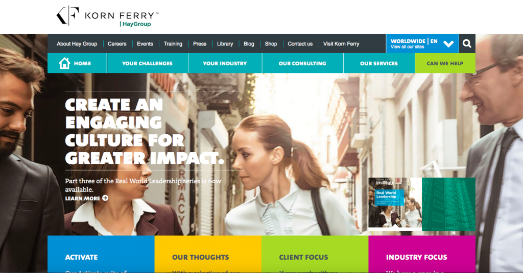
5. Hay Group (https://www.haygroup.com/#)
What we like about it: One thing this site gets right is the use of a vibrant and colorful block layout that stands out greatly from many of its competitors and particularly speaks to an audience of young professionals. We love the engaging navigation content: “Your challenges,” “Your Industry,” “Our Consulting” and “Our Services” and “Can we help?”
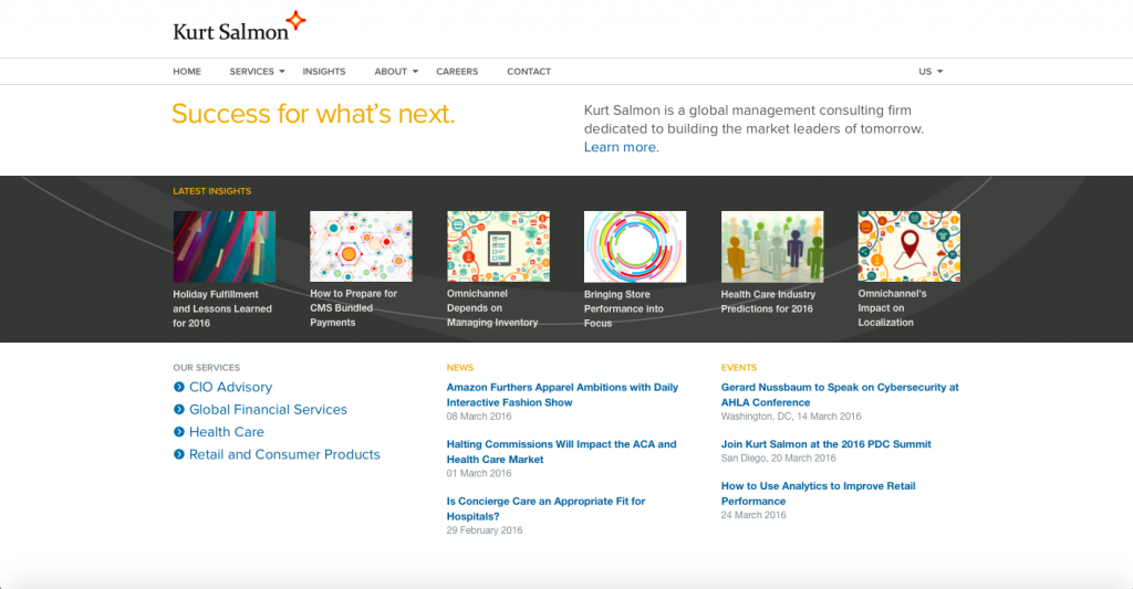
6. Kurt Salmon (https://www.kurtsalmon.com/en-us/)
What we like about it: If you’re a straight-to-the-point type of person, you can appreciate this site’s extremely concise content. We like that the user can see all that the homepage has to offer without scrolling. You can clearly see the firm’s mission statement, what services it provides and what events are coming. Even the menu is bare bones, which adds to the usability of this site.
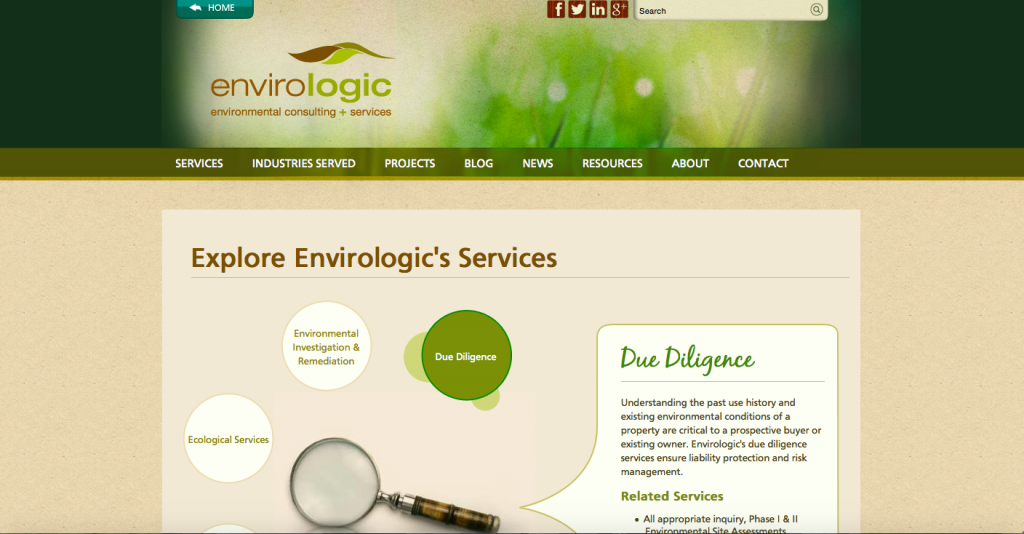
7. Envirologic (https://www.envirologic.com/home)
What we like about it: The natural color palette of this site aids in the overall identity of the environmentally-driven company. We like the infographic that pairs each link with a blurb of information and suitable picture. We also like the use of a blog widget that shows recent posts and the lean navigation menu that takes to one page instead of having multiple drop-down options.
These companies are forging into the future of their industry by ensuring that their online presence is approachable and in some cases even beautiful or vibrant in nature.
These are some great examples that prove no matter how technical the work, web design is a crucial tool when it comes to connecting with a diverse audience and growing a business – any kind of business.