Learning Hub | Website Design Inspiration
Top 2018 Industrial Mining & Precious Metal Website Designs
March 3, 2018 | Jon Teodoro

Here we go with another round of our Top 2015 Website Designs. This edition is specifically focused on the mining and precious metal industry.
As it turns out, only a handful of companies in this industry are investing the time into making sure their online presence looks up-to-date. These companies collectively specialize in mining precious metals from the Earth or supply materials and equipment to make these things happen. If it wasn’t for these mining giants, we wouldn’t have coins, jewelry, certain food additives, or even alternative sources of energy. One of the companies on this list specializes in mining from asteroids (what?!).
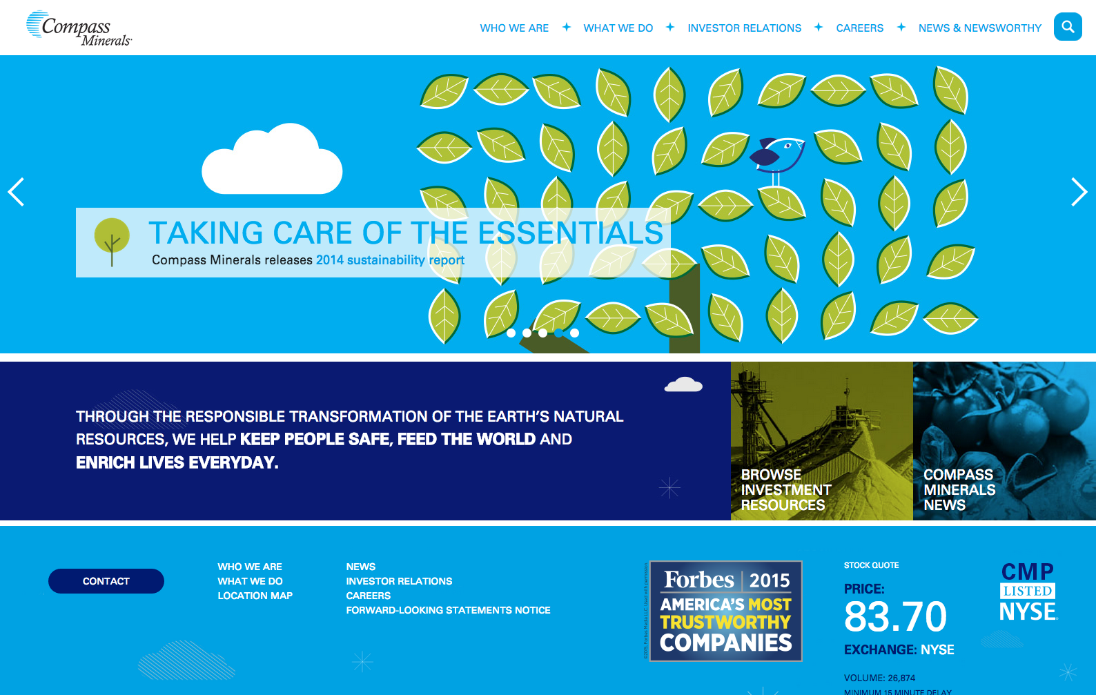
- Compass Minerals
What we like about it: Bold color scheme and excellent use of ‘organic’ imagery to convey the statement of their “responsible transformation of the Earth’s natural resources”.
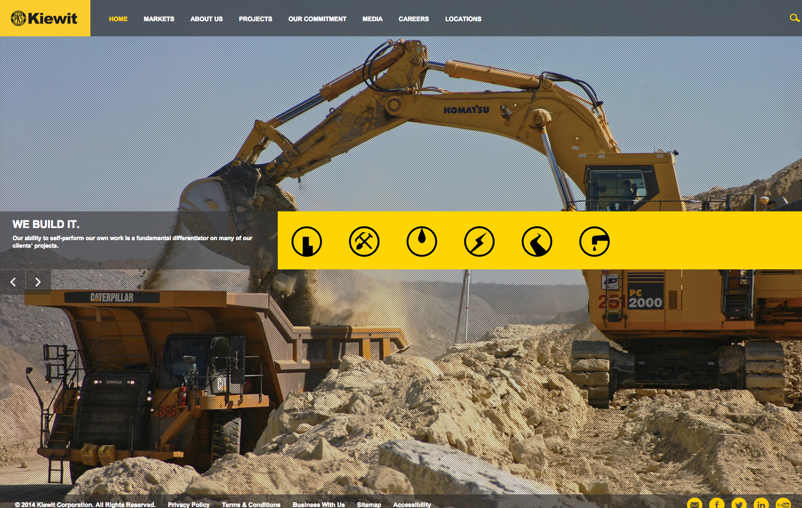
- Kiewet
What we like about it: Big, full screen picture with cycling images to represent each icon. Clean navigation across the top and bottom.
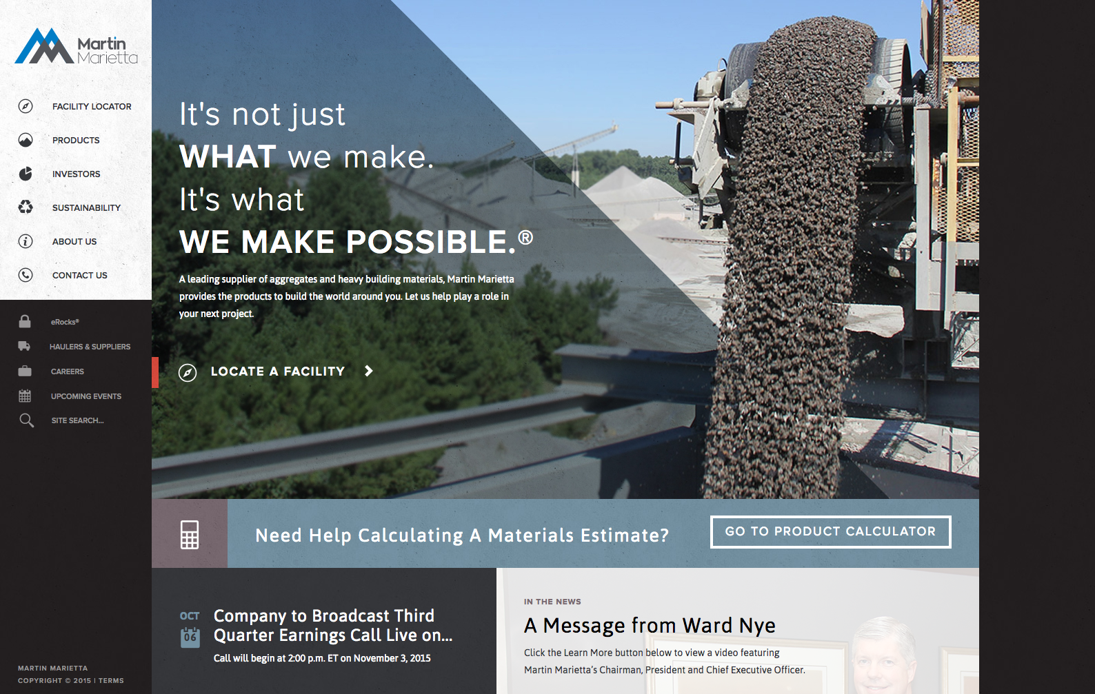
- Martin Marietta
What we like about it: Clear call to action above the fold to drive visitors to a product calculator along with a nicely designed sidebar navigation and cool “boxed” layout.
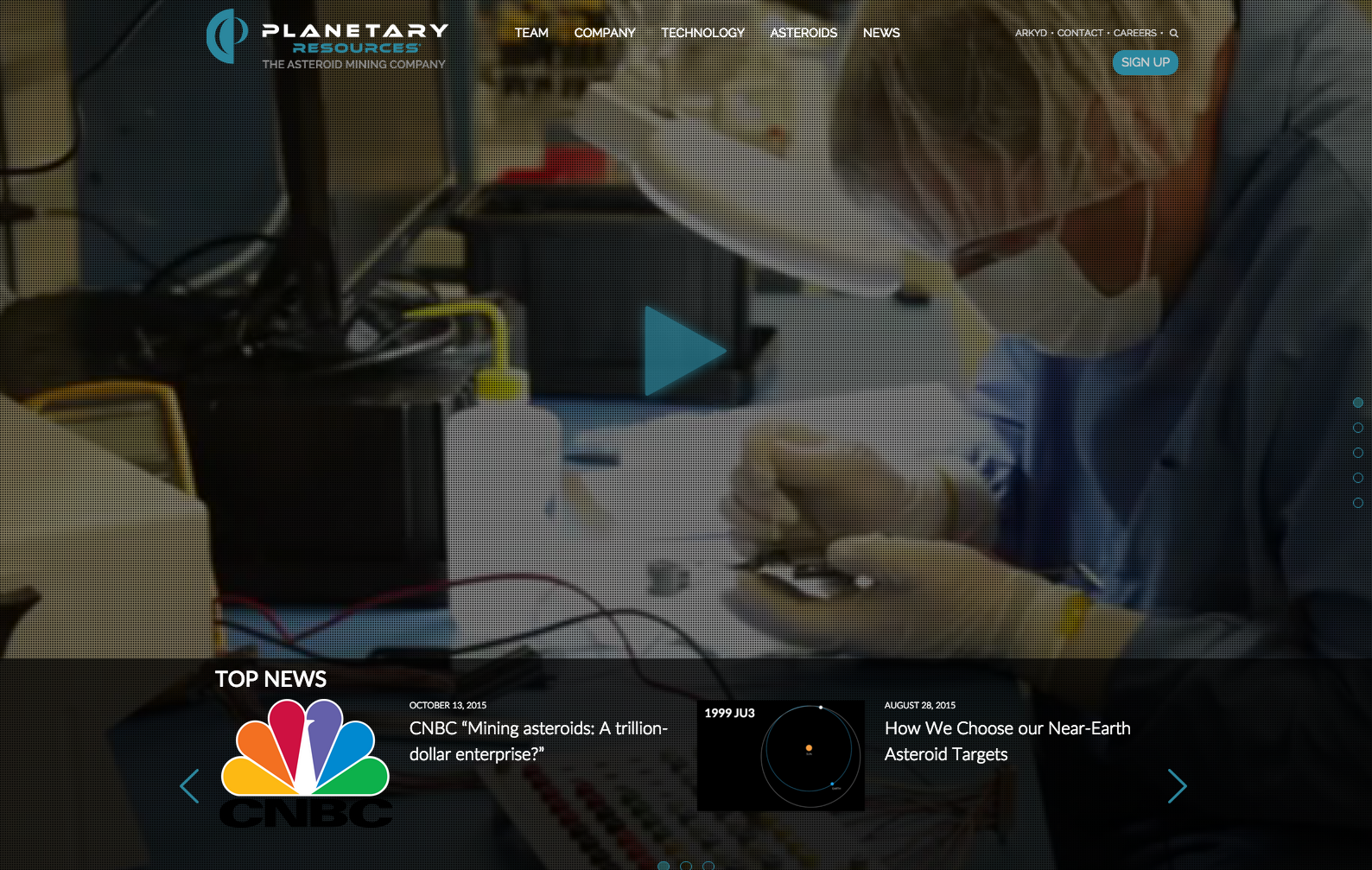
- Planetary Resources
What we like about it: Full screen video background that loads fast, showing their process. You gotta have a really cool website if you’re mining stuff from asteroids.
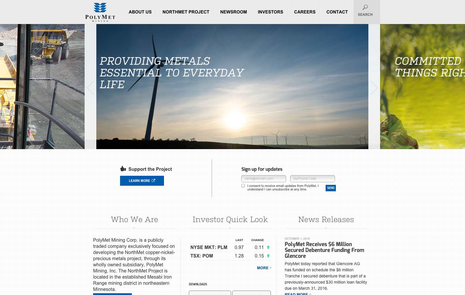
- Polymet Mining
What we like about it: Really clean home page with a dynamic slider. Very simple design with a call-to-action to collect email addresses.
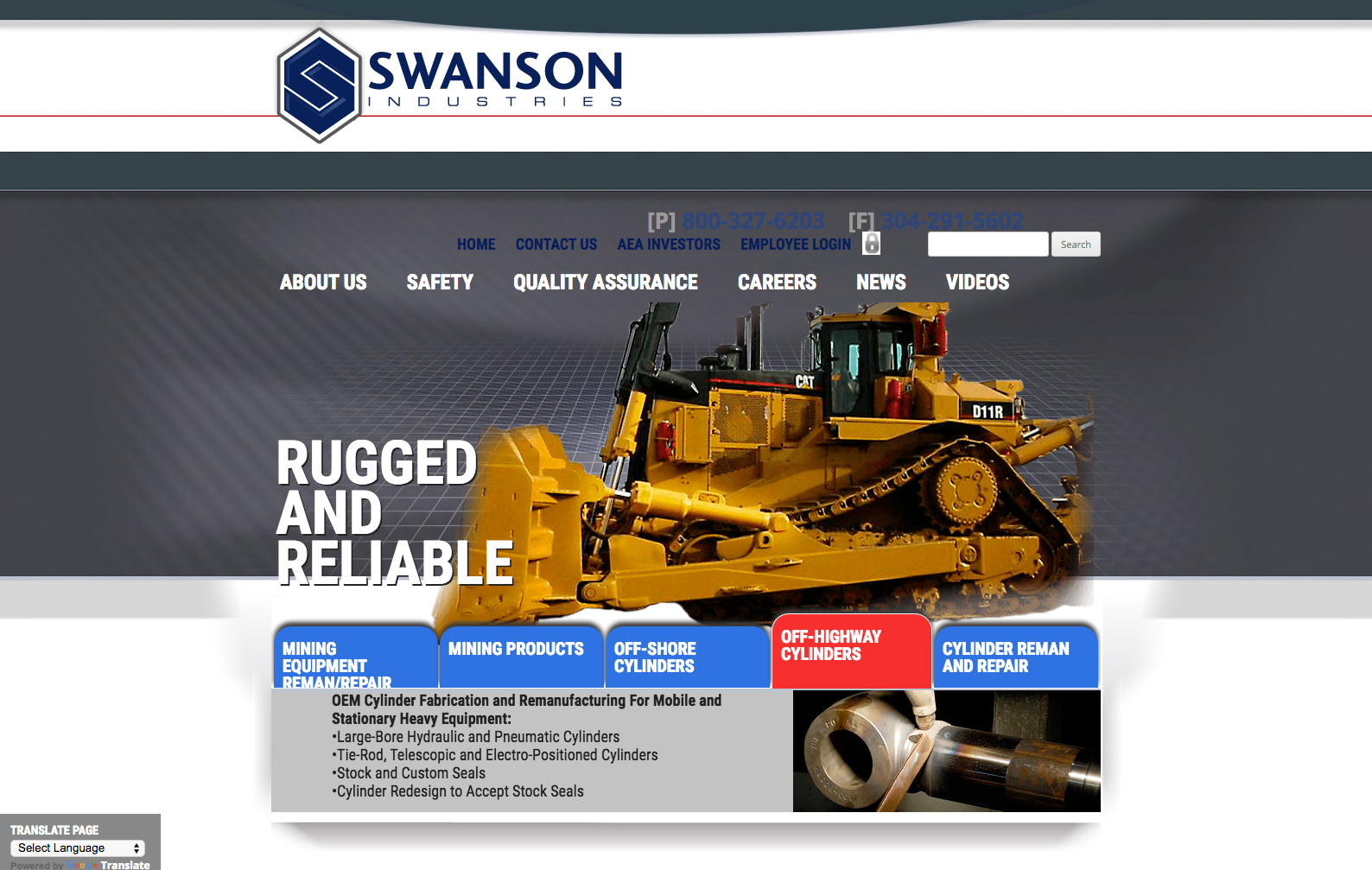
- Swanson Industries
What we like about it: Bold, industrial design with clear headlines with corresponding tabs that move with the slider.
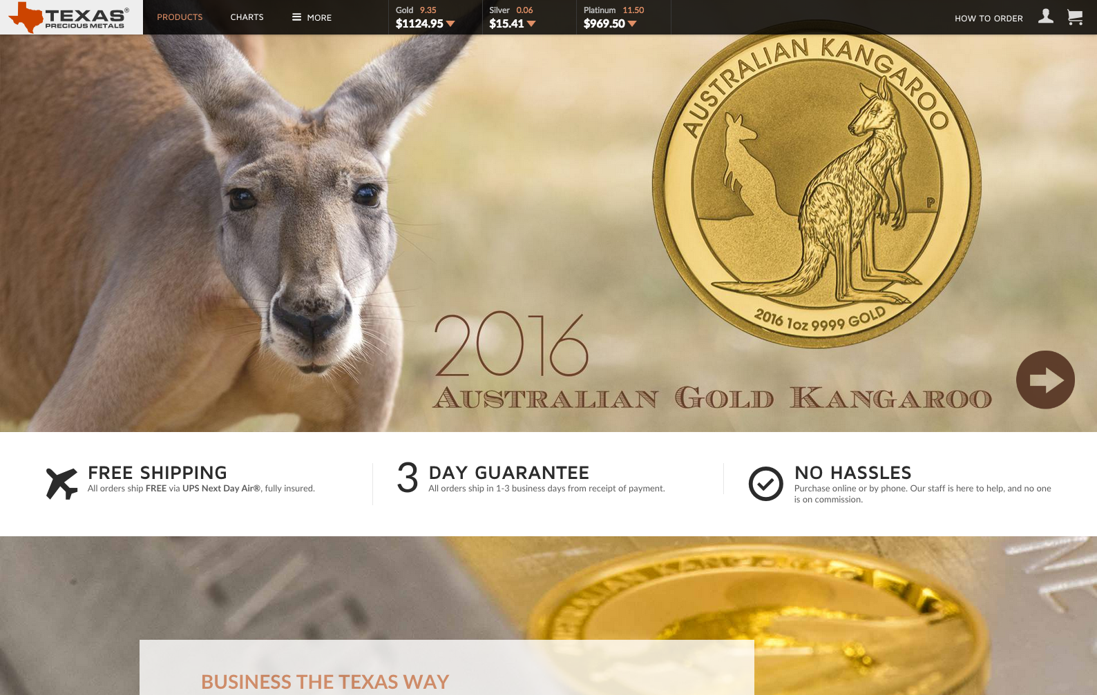
- Texas Precious Metals
What we like about it: Big bold imagery with a clear theme of gold. Clean navigation at the top and short, concise copy.
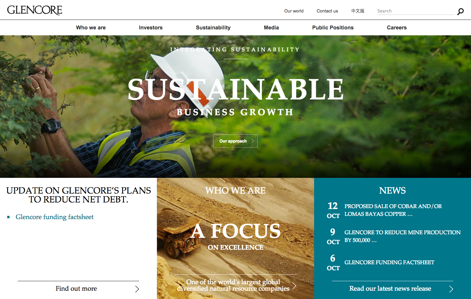
- Glencore
What we like about it: Full screen boxed layout with great use of contrasting sans-serif and serif fonts. Great use of colors.
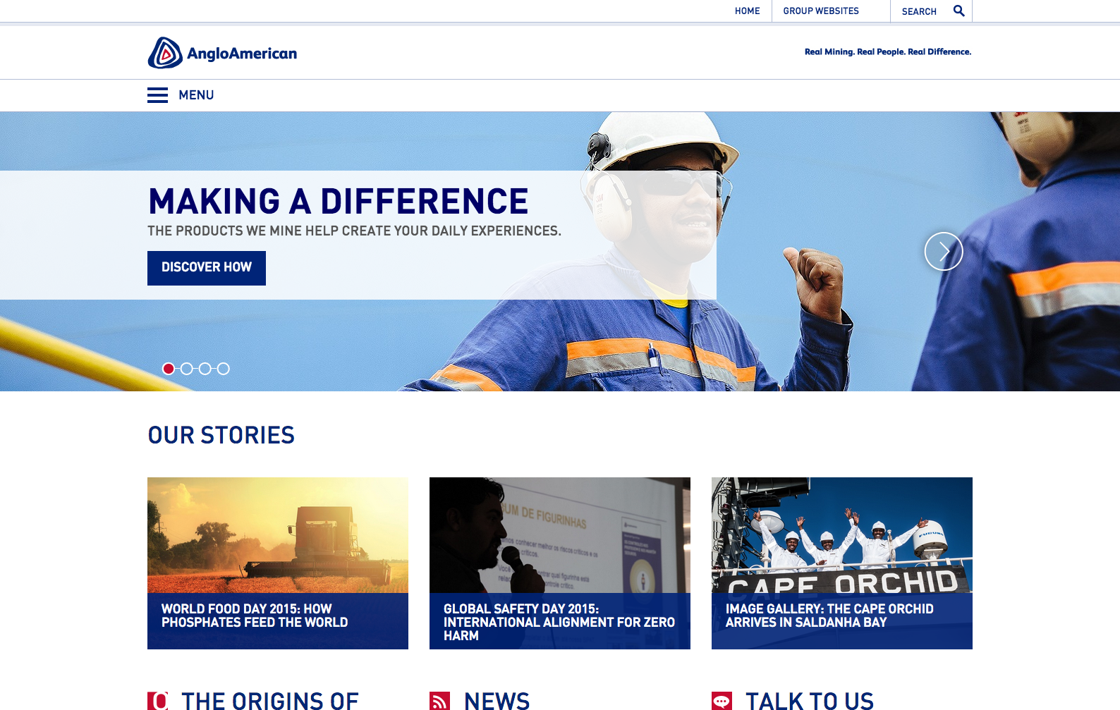
- Anglo American
What we like about it: Progressive menu button and clean, slider with minimal text on the home page.
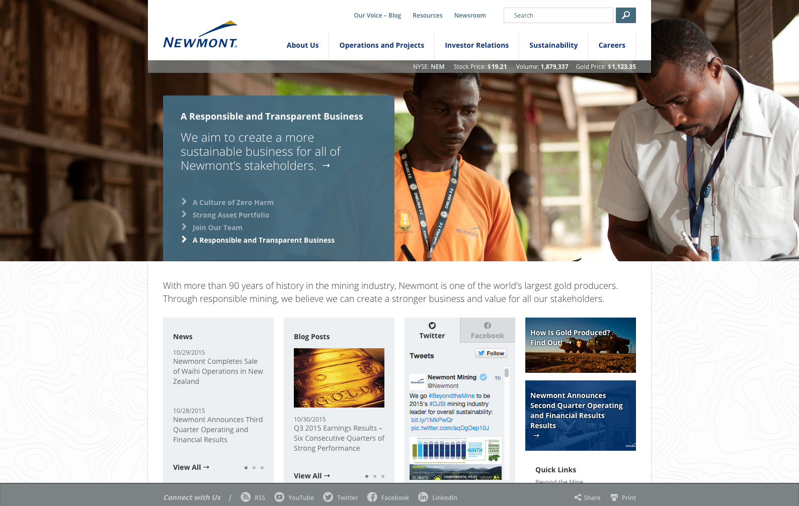
- Newmont
What we like about it: Big slider images with a nice corporate style design. Easy way to navigate to the relevant pages within the website itself.

