Learning Hub | Website Design Inspiration
Top 2018 Food Service Website Designs
January 25, 2018 | Jon Teodoro

Design is an important factor in all aspects of our lives – many we don’t even realize. But, there may be no more greater opportunity to pull consumers in through good design than in the foodservice industry.
Videos of sizzling bacon, pictures of gourmet meals and decorated desserts not only make consumers’ mouths water, but can be a call to action all on their own. And we haven’t even gotten to the content yet!
The foodservice industry is vast. The following are just a few companies that we think nailed site design.
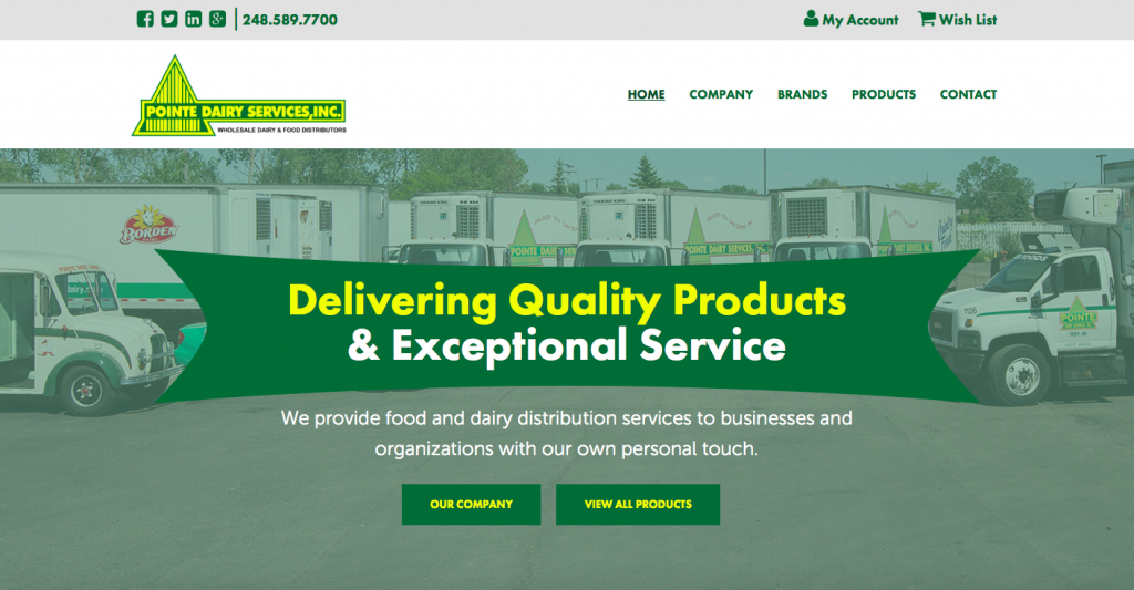
1. Pointe Dairy (https://pointedairy.com)
What we like about it: The contrast of the banner and bright font look great on top of the less saturated background photo. It immediately lets users know what they deliver and provides links to the products organized by type. Having their phone number and a member login easily viewable in their footer makes the site very efficient for quick contact.
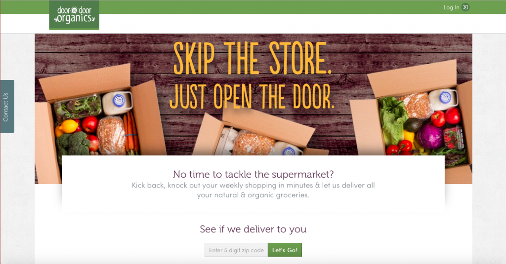
2. Door to Door Organics (https://www.doortodoororganics.com)
What we like about it: This site design is like the lettuce in the background photo – crisp. The image provides a fresh look and feel, and we love the “see if we deliver to you” entry field above the fold. The simple design works well for a site that is geared more toward individuals than corporations. No muss, no fuss.
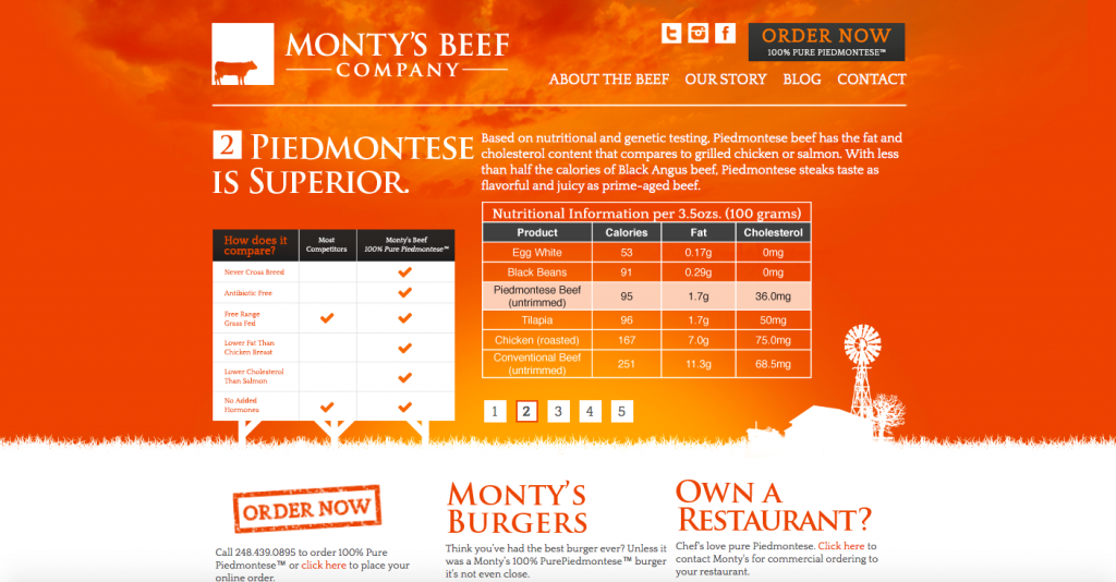
3. Monty’s Beef Company (https://www.montysbeefco.com)
What we like about it: The stark orange and white color scheme is aesthetically pleasing, but we think the real winner on this site is the use of a nutritional chart and infographic above the fold. These tell the user everything they need to know about the product using extremely concise content. The stencil-like overlaid farm image is a nice touch visually.
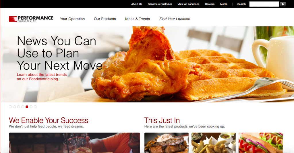
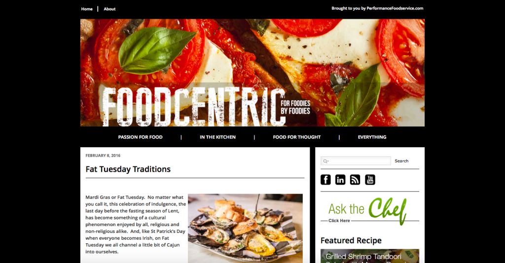
4. PERFORMANCE Foodservice (https://www.performancefoodservice.com)
What we like about it: This site has multiple menus and ways for users to navigate, which is great because everyone likes to search differently. However, this company has taken their industry involvement a step further with a newsletter and their FoodCentric blog, which has its own beautiful design and provides tons of supplemental advice for their customers.
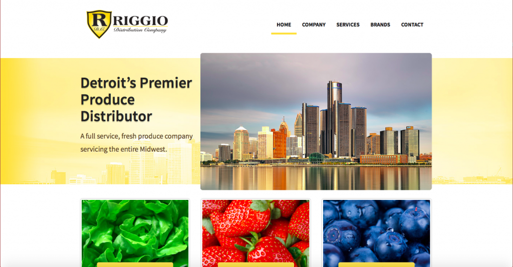
5. Riggio Distribution Company (https://www.riggiodistribution.com)
What we like about it: It’s local! No, no. All jokes aside, Riggio implements clean images that coordinate with its links and let the user know what they sell immediately – produce. Each menu link goes to only one page option, which makes this site map simple, straight-forward and scroll-light.
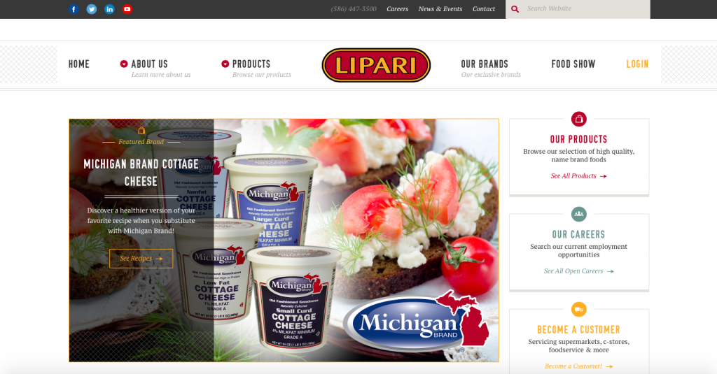
6. Lipari Foods (https://liparifoods.com)
What we like about it: The use of the logo in the middle of the navigation is a nice change from the more uniform top left placement. Each box of information has a corresponding icon, which is nice for visual scanning, and they provide recipes that use their exclusive (we love this choice of content, btw!) brands.
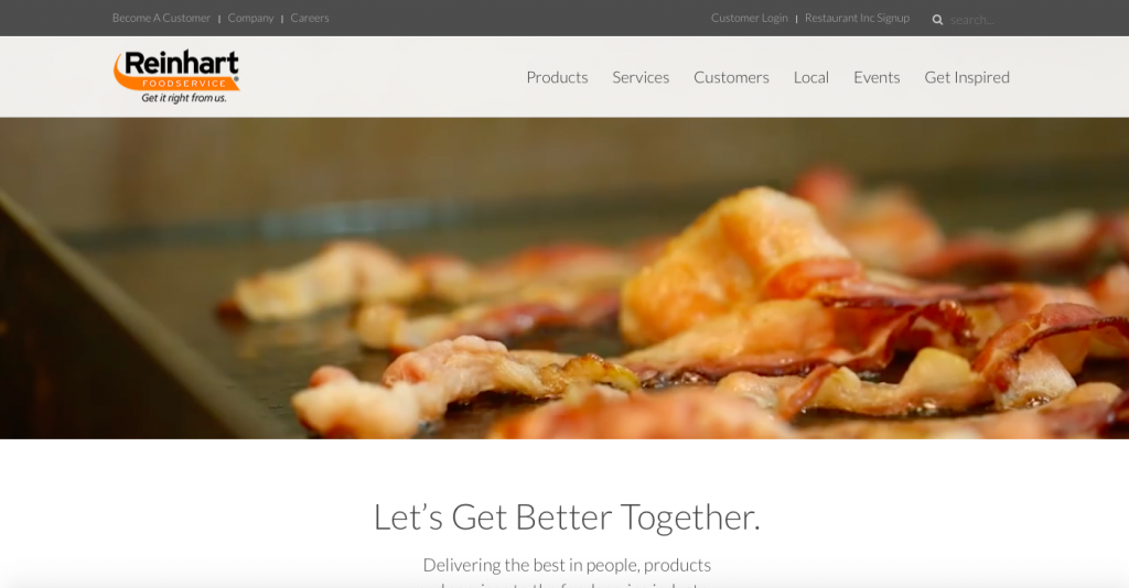
7. Reinhart Foodservice (https://rfsdelivers.com)
What we like about it: Clean margin space and a nice light font draw the viewer’s eyes right to what counts – that sizzling bacon! And that’s not all. That slider image is actually a video, and it rotates between leafy greens blowing in the breeze, grilled steak popping and smoking and pizza cheese burbling in the oven. The videos make you hungry (a problem), and they offer their products (the solution). We’d say that’s a win/win!
We all have personal, primal connections to food. Not only do we need it, but we want it. This industry can capitalize on these primitive desires with design that entices and arouses our senses.
These sites use high quality photography and videos to supplement their product info. If they can make your mouth water, they can make a profit.