Learning Hub | Website Design Inspiration
Top 2018 Fitness Website Designs
January 14, 2018 | Jon Teodoro
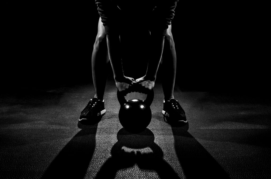
Lean muscles. Shredded abs. Toned thighs. Healthy eats. From food blogs to fitness gurus, the advice on how to build a better body and a healthier lifestyle is easy to find on the web. A quick Google search and you can get any info you want – just stay away from Web MD (kidding!).
The promise of a better physique is great, but we like to get our info from websites that implement nice design and consider our user experience when dishin’ out the advice. Below are ten sites we can rep (gym pun, anyone?).
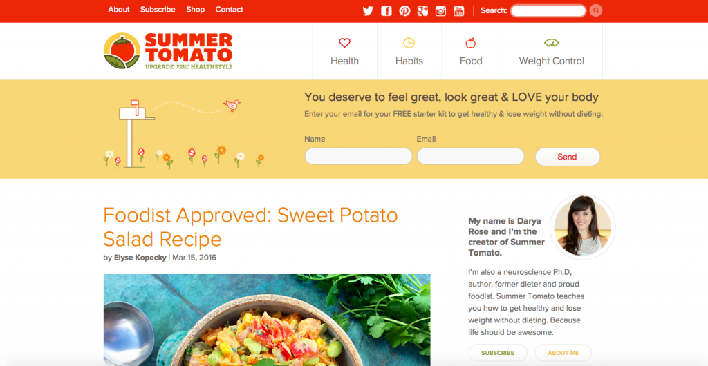
1. Summer Tomato (https://summertomato.com)
What we like about it: This food blog has a wistful and simple design with plenty of social media connections and a nice use of a sidebar to introduce the lady behind it all, Darya Rose. We love the easy to read blog structure, the subscription form that grabs attention above the fold and the navigation menu icons.
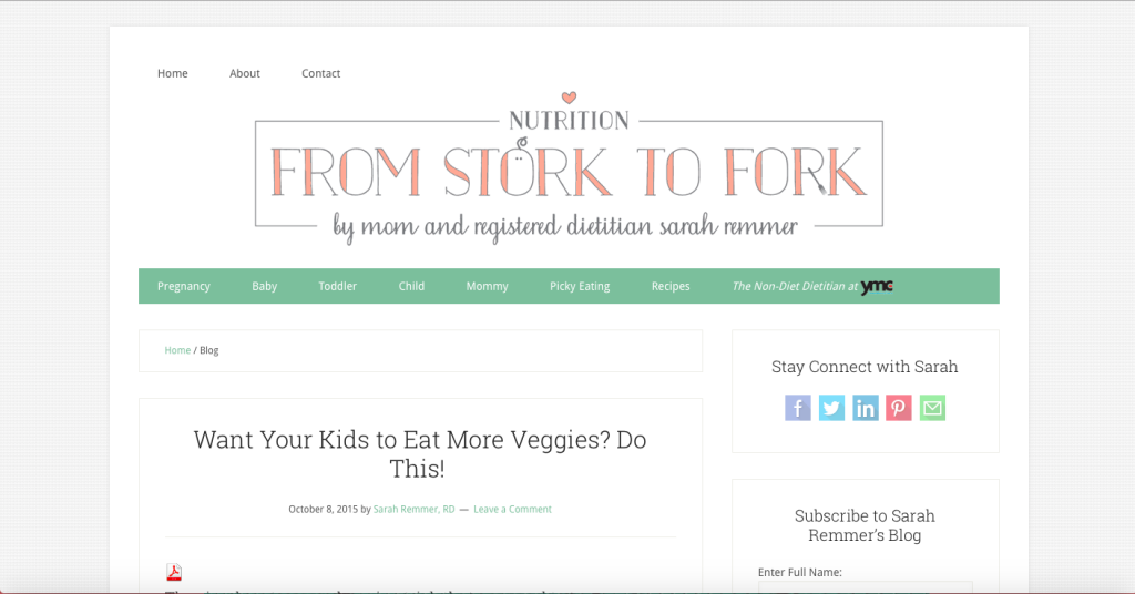
2. From Stork to Fork (https://www.sarahremmer.com/blog/#sthash.5EtjusB3.dpbs)
What we like about it: This nutrition blog comes to you from mom and dietician Sarah Remmer. Aside from the clever blog name, the page has a very clean design that utilizes a lot of white space – a designer dream. We particularly like the navigation breakdown, which separates posts based on the child’s developmental stage and even includes tips for pregnancy and picky eaters. Everything on the site feeds into the identity including the customized logo.
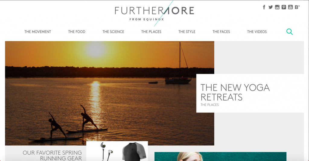
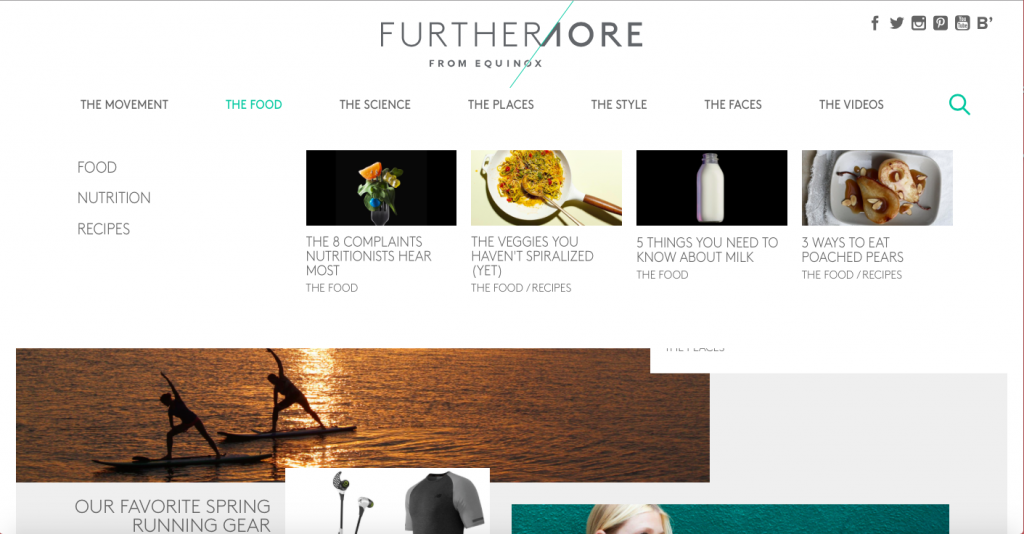
3. Furthermore from Equinox (https://furthermore.equinox.com)
What we like about it: This website covers everything from fitness guides to workouts to style and retreat suggestions. The box layout quickly draws the eye from one headline to the next making it clear and easy to digest the information. Our favorite feature is the use of pictures in the navigation links – a unique way to pull readers in.
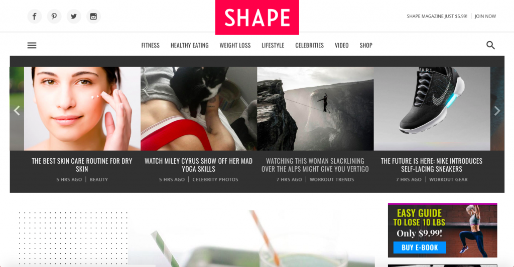
4. Shape Magazine (https://www.shape.com)
What we like about it: This magazine has a large enough reputation that they don’t have to do a lot of selling on their site, but they still chose a direct sale pitch in the top right corner that tells users their pricing and provides an action – “Join now.” They also sell downloadable ebooks, which are a great marketing technique for getting money from users who don’t want to pay monthly fees.
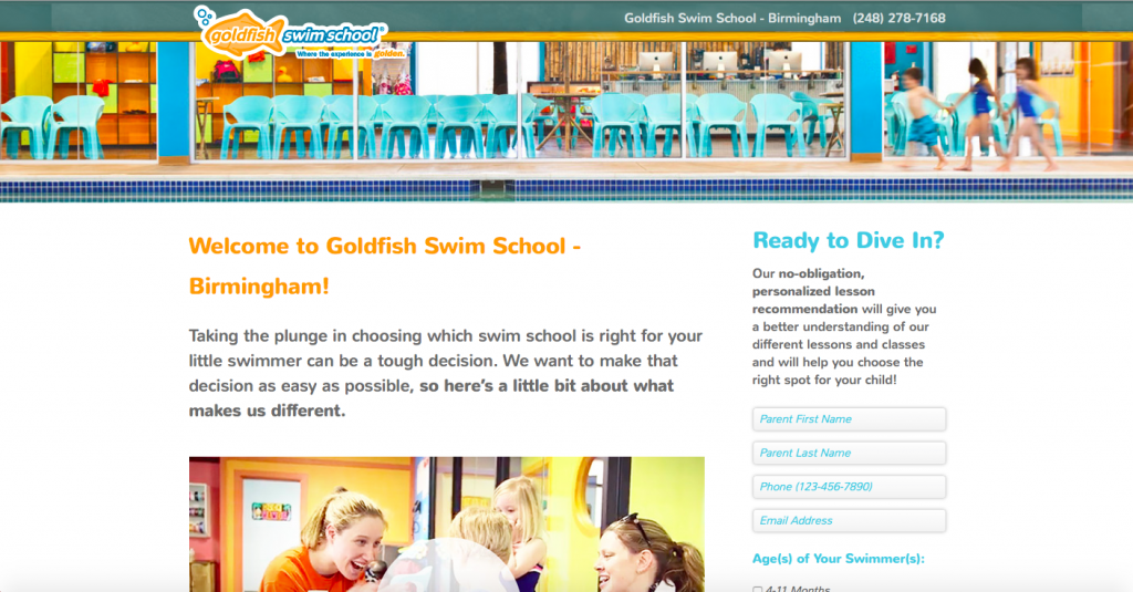
5. Goldfish Swim School (https://go.goldfishswimschool.com/birmingham?cid=348)
What we like about it: Fitness regimens can intimidate some people so I thought we’d dip our toes in first. This site is nothing fancy, but it does what it needs to do. A local swim lesson school, Goldfish Swim chose to use a video to tell what sets them apart from competitors, which is extremely successful. It cuts down on content and puts faces and images with information for parents. Plenty of calls to action on this page direct users to “Dive in!”
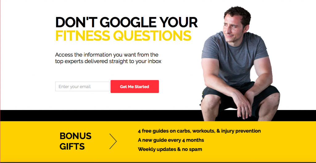
6. Born Fitness (https://www.bornfitness.com)
What we like about it: Many people want to workout at home these days and sites like this make it simple. This site diverges from the norm of having menu options at the top of the page. Here, we think it works. You can find the navigation in the footer, but Born chose to get straight to the point with an email subscription form, a succinct bulleted list of benefits and a tagline we love- “Don’t Google your fitness questions!”
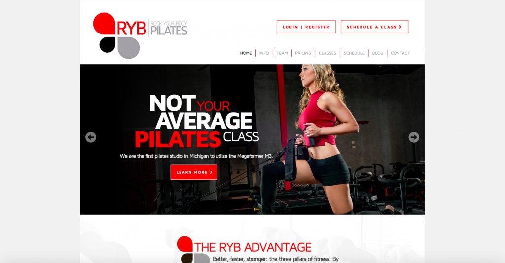
7. Rock Your Body Pilates (https://rybpilates.com)
What we like about it: An attractive color palette that coordinates with the images used on the page, intriguing content that pulls users in to learn more, nice use of a slider and margin space for a polished look.
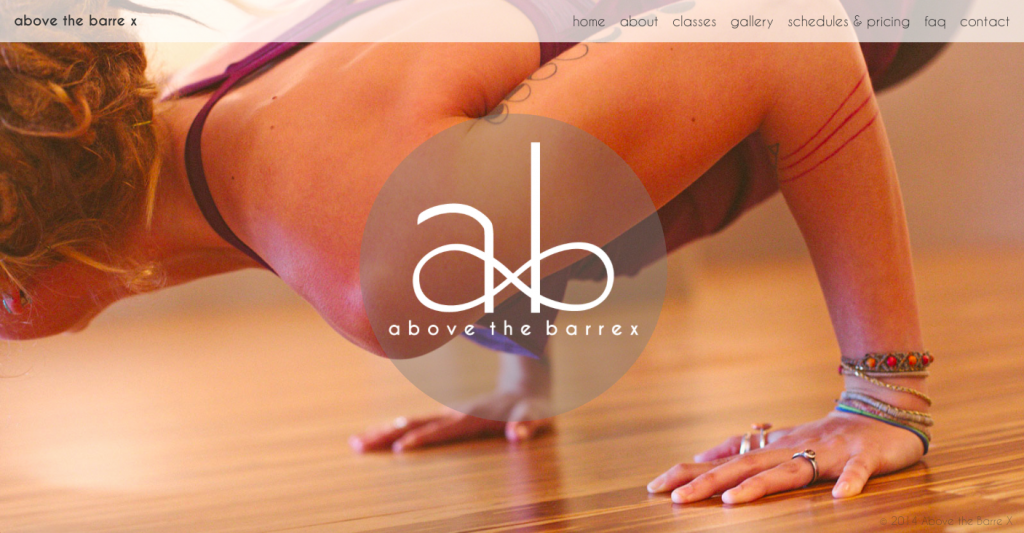
8. Above the Barre X (https://abovethebarrex.com)
What we like about it: A good example of a small, locally-owned business using professional design, ABX chose full-page, colorful rotating photos of their class members and teachers as their background. You may as well have walked into the studio IRL. We love the contrast of the high quality photos with the rest of their site’s pages which have a simple white background and black text. Design this pretty may just get us to break a sweat!
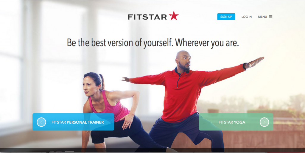
9. FitStar (https://fitstar.com/)
What we like about it: Fitness apps and trackers abound in our on-the-go modern lifestyle so it only makes sense to include them here. This beautiful site uses a parallax scrolling technique to give it depth, testimonials to give its product credibility and plenty of opportunities to download the app on all platforms – phone, tablet, computer and television.
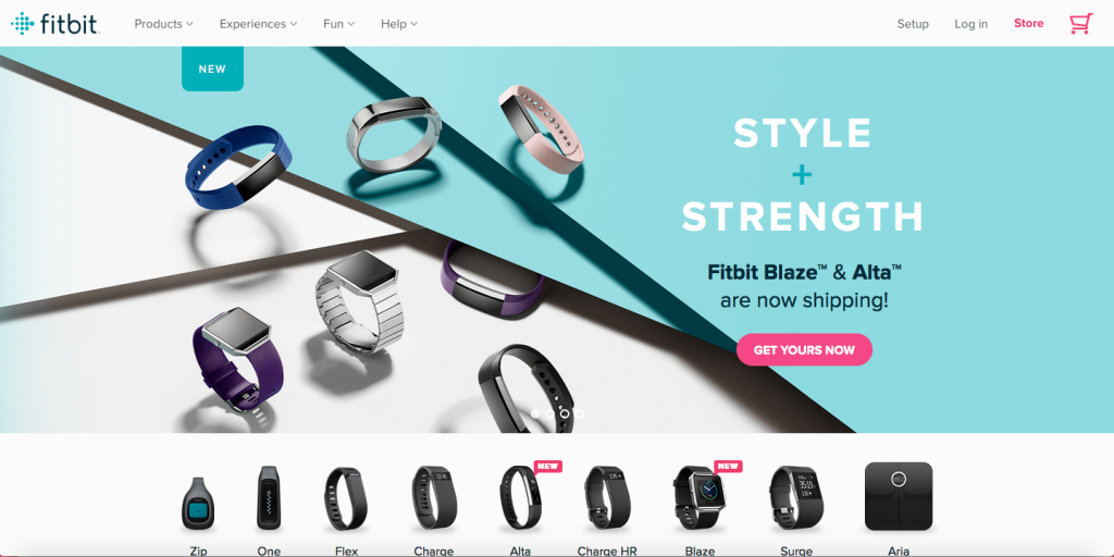
10. FitBit (https://www.fitbit.com/)
What we like about it: This site could be taught in Marketing 101. It’s sleek, each product has its own page and there is a section dedicated to helping new users choose which product would work best for their lifestyle. Prices are clear and the multitude of buying options are organized for easy online shopping. It hits the main goal of informative merchandising: You can go in a novice and end up a know-it-all.
These sites bring beauty and sleek design into their marketing identity or brand to sell their product. Whether it’s a gym membership, a magazine subscription or advice they’re selling, we think these sites show how important web design can be in brand management.
Would you rather take advice on how to “design” a better body from a company that strives to understand you as a consumer or one that simply throws their product info on a page and calls it quits? We think we know the answer.